Age Verification
This website contains age-restricted material including nudity and explicit content. By entering, you confirm being at least 18 years old or the age of majority in the jurisdiction you are accessing the website from.
Our parental controls page explains how you can easily block access to this site.
0
Why do colors and lighting of clips differ so much from previews pictures? 论坛 / 关于iStripper的一切
rageinblack
已加入 在 Jul 2018 44 发布
July 29, 2018 (edited)
So yeah I wonder, why do colors and lighting of clips differ so much from previews pictures?
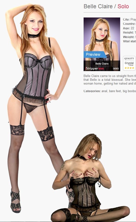
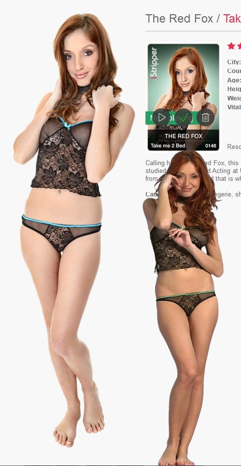
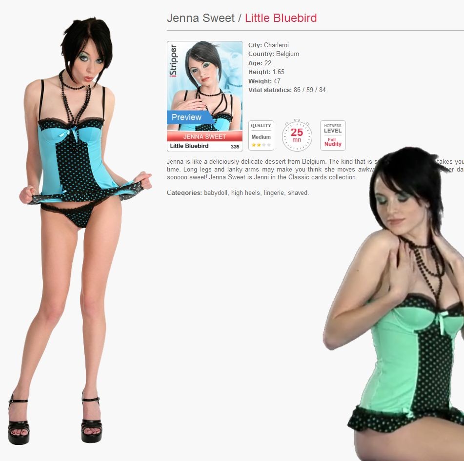
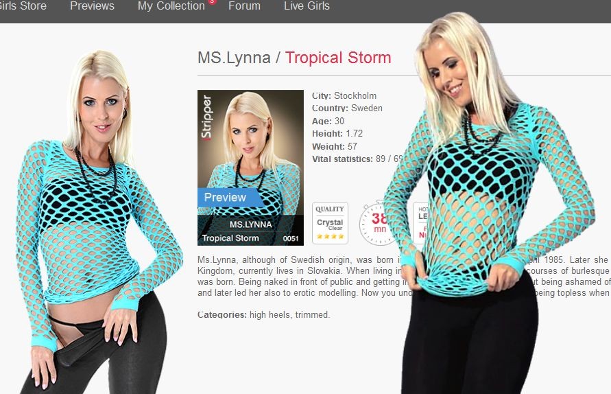
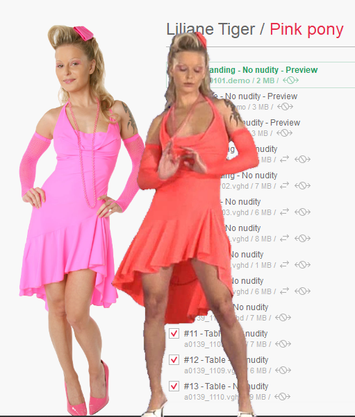
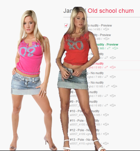
These are just 2 examples of Crystal Quality. But there are many more. I'm a sensible guy when it comes to brightness, colors, and contrast :D
I think Totem should fix all their clips regarding lighting and colors to match the preview pictures. The preview pictures are much more gentle on the eyes, mainly because they are brighter, have less contrast and have softer tones. Sometimes the video quality also differ a lot from what we see in the picture preview. Especially the edges of the model, don't let me even start with the color and ligting mismatch of the low quality clips.
Perhps totem should let the user set up the brightness, gamma, contrast and color intesity in real-time.
rageinblack
已加入 在 Jul 2018 44 发布
July 29, 2018 (edited)
ok that makes sense, but maybe once you substract the chroma key background, you are left with a clean background and you could probably save it somehow as completely transparent and work your way from there to additionaly fix the color hue without affecting the chroma key background... I'm not an expert, obviously, but I believe something like this could be done...?
However, they could perfectly fix the brightness, just a nudge to the middle tones, most clips I've seen so far are just too dark or too high in contrast.
However, they could perfectly fix the brightness, just a nudge to the middle tones, most clips I've seen so far are just too dark or too high in contrast.
pantalone
已加入 在 Nov 2010 224 发布
July 29, 2018
Perhps totem should let the user set up the brightness, gamma, contrast and color intesity in real-time.
So I tried it. Well, not in real-time, in Photoshop with a screen-grab. The idea was to identify parameters that I could put into a shader, adjusting the clip colouring in the video clips. It turns out that it is almost impossible to adjust the video image, as shipped, to replicate the colours of the stills.
The reason seems to be that the Totem's shader applies different gamma curves on different colour channels. We don't know what those channels are or the curves used and they are baked into the video file, so we can't match the vids to the stills. I don't think they are the same for each card, but they reflect Totem's view of the best performance that they can deliver to the greatest number of customers' different PC setups.
I have also tried messing about with filters and screen settings and have concluded that, given that Totem ships an instantly playable product in a compressed file, there's not much we can do about it. Other members have produced improvements (@Z22 had a go at improving scaling, which could also be better), but perhaps the file size or processing requirements would be too much for many users.
..but if you can find a way to do it I'd love to know!
July 29, 2018
Also, The Stills are Shot against a White Background, with Much Different Lights.
The Video's are shout using over a dozen different Lights positioned at different angles an intensities to try and eliminate Shadows.
You couldn't use the same lights that flash Photography uses, so Video will look different from Flash / Still photography.
but Most of the HUE difference is from the ChromaKey Process.
if you Chroma Key with Blue, Turn all the Blue Hues to Transparent.
it also removes blue from all of the other colors.
even the skin tones..
Purples, Pinks, Blue are prime examples...
When you Chromakey with Green
Skin tones are affected differently than blue.
There is a way, but it takes a whole lot more processing time...
it would probably make the post processing take 100 to 1000 times as much time...
I think it is called RotoScope
Frame by Frame, the Subject is Outlined and copied, leaving an exact copy removed from it's background.
Many of the Movies that have been converted from 2D to 3D have Been Rotoscoped.
rageinblack
已加入 在 Jul 2018 44 发布
July 29, 2018 (edited)
@Wyldanimal Yes, I know exactly what you're talking about, and I too thought they were using a white background, the only thing that I didn't understand is how models can still have perfectly white lingerie while making the white chroma key screen transparent. Obviously when they wear white ligerie they use a different color screen as background, right?
@pantalone thanks for trying and for the explanation, it makes sense, but I thought they, Totem, should edit their raw video files, there is no point in working with compressed video when it comes to applying such effects, so much color tones and data get lost in the compression. And then simply reupload them on the server, for us to update. Maybe not today and maybe not tomorrow but I think this is bound to happen since the service will be constantly striving for offering a better quality product to the customer and the customers will be alway more and more picky, kind of thing. My advice to Totem would just be make them a bit brighter from now, which should be easy as ***** the midtone brightness slider on a raw video, before compression... and tr yto match the picture preview, not that would be really cool.
@pantalone thanks for trying and for the explanation, it makes sense, but I thought they, Totem, should edit their raw video files, there is no point in working with compressed video when it comes to applying such effects, so much color tones and data get lost in the compression. And then simply reupload them on the server, for us to update. Maybe not today and maybe not tomorrow but I think this is bound to happen since the service will be constantly striving for offering a better quality product to the customer and the customers will be alway more and more picky, kind of thing. My advice to Totem would just be make them a bit brighter from now, which should be easy as ***** the midtone brightness slider on a raw video, before compression... and tr yto match the picture preview, not that would be really cool.
pantalone
已加入 在 Nov 2010 224 发布
July 29, 2018
I hadn't heard the term rotoscope and looked it up. I am now stuck with the image in my head of dozens of Totem gnomes laboriously tracing round each frame on glass plates... Great word, though.
I had this idea that chromakey was pretty specific to the background colour. Certainly the Photoshop colour selection can be tuned precisely and when they use it on TV news the image looks ok. And I'd have thought that hue is a function of colour temperature of the lights, rather than the number of them, but I don't know anything about exposure on video cameras, so I'll take your word for it!
I had this idea that chromakey was pretty specific to the background colour. Certainly the Photoshop colour selection can be tuned precisely and when they use it on TV news the image looks ok. And I'd have thought that hue is a function of colour temperature of the lights, rather than the number of them, but I don't know anything about exposure on video cameras, so I'll take your word for it!
gdavis
已加入 在 Apr 2008 24 发布
July 30, 2018
but Most of the HUE difference is from the ChromaKey Process.No it doesn't.
if you Chroma Key with Blue, Turn all the Blue Hues to Transparent.
it also removes blue from all of the other colors.
even the skin tones..
The difference is just the different lights and camera, and lack of color management. Frankly, if they put a little effort into it they could get it to match much more closely. The iStripper application isn't even color managed. I have a high end wide gamut calibrated monitor and everything in iStripper is over-saturated because it doesn't apply the monitor profile (I really wish this feature would be added). The still images aren't even tagged with a color profile. If they are sRGB then this is OK for most people, but it's such a simple thing to add and again helps on systems that are setup for color management.
I love this program and it's come a long way, but I can't help feeling color management is still being largely overlooked.
July 30, 2018 (edited)
No it doesn't.
The difference is just the different lights and camera, and lack of color management. Frankly, if they put a little effort into it they could get it to match much more closely. The iStripper application isn't even color managed.
Hummm, Lets See....
Totem has been doing this for almost 30 years.
So they can be Considered to be the Experts in their industry.
I just luv how all the members with some experience think they know how to do it better
when they don't even know what the process is.
It's a Proprietary process.
I used the Terminology ChromaKey, as that is something you can look up and relate too.
but it's not ChromaKey..
It's different.
So, Yes, you're correct that ChromaKey doesn't affect the other colors.
But that is not the Process Totem uses. It's their own Proprietary process.
Video Production
Lets have a look at a video Production...
how about a 30 second or 60 second Commercial.
How much time and man hours are spent on that.
Weeks, Months.....
How about a Motion Film.. 90 minutes to 120 minutes
How Many Months or Years are spent on it...
( that's the same video length as about 4 cards from Totem )
Now Compare that to a Full Card, with 30 Minutes of Video.
That is Produced in a matter of 1 production day.
1 Card of 30 Minutes of Video every day
There is No other Video Production Group doing anything like this.
30 minutes of processed Video ( and it's actually more than 30 minutes ) in a day.
July 30, 2018
Re: 1 Card of 30 Minutes of Video every day
Somehow I thought they produced 6 cards in one or two days, but I guess that is just studio time. Obviously they are producing one good card a day on average because they are selling one new card each day.
Somehow I thought they produced 6 cards in one or two days, but I guess that is just studio time. Obviously they are producing one good card a day on average because they are selling one new card each day.
gdavis
已加入 在 Apr 2008 24 发布
July 30, 2018
Hummm, Lets See....You have no idea what experience I have. Are you suggesting that because I don't know the specific details of the process, I'm incorrect in surmising that they use different light setups and different cameras for the stills and video? We're talking about digital video and photography, it's not that difficult to make a fairly decent deduction about certain aspects.
Totem has been doing this for almost 30 years.
So they can be Considered to be the Experts in their industry.
I just luv how all the members with some experience think they know how to do it better
when they don't even know what the process is.
It's a Proprietary process.Fair enough.
I used the Terminology ChromaKey, as that is something you can look up and relate too.
but it's not ChromaKey..
It's different.
So, Yes, you're correct that ChromaKey doesn't affect the other colors.At least I got something right
But that is not the Process Totem uses. It's their own Proprietary process.
Video ProductionHow about televised news. Hours a day in real time.
Lets have a look at a video Production...
how about a 30 second or 60 second Commercial.
How much time and man hours are spent on that.
Weeks, Months.....
How about a Motion Film.. 90 minutes to 120 minutes
How Many Months or Years are spent on it...
( that's the same video length as about 4 cards from Totem )
Now Compare that to a Full Card, with 30 Minutes of Video.
That is Produced in a matter of 1 production day.
1 Card of 30 Minutes of Video every day
There is No other Video Production Group doing anything like this.Assuming a program like Photoshop is being used, adding the profile to the still images involves checking a box once. Not once per image. Not once per set of images. Once. Impact to producing cards is negligable.
30 minutes of processed Video ( and it's actually more than 30 minutes ) in a day.
Implementing color management in the software is a programming task, impact to producing cards is none. Granted, this could be a significant effort to add, but it's a one time effort. I mentioned it because it is something I feel would be beneficial and would like to see if it's realistically feasible.
Yes, no one else doing exactly what Totem is doing, and I acknowledged that they've come a long way. In fact I'd say the more recent cards probably match very well between stills and video when viewed properly. But it's obvious that there have been and stil are some significant shortcomings. The color can vary so much that even lay-people can not only notice it, but feel compelled to post about it. And this isn't the first time. Color management is not ground breaking, it's something many photo and video professionals do every day.
I'm not trying to put Totem down here. I know there's a lot of ***** that goes on in the forum, much of it unwarranted, but I genuinely feel this is an aspect that can be further improved. Totem usually seems pretty open to things we'd like to see improved, so why the attack on constructive criticism? I could have just said "ya, it sucks, they don't know what they are doing". But I didn't. Instead I provided some simple suggestions that I felt were overlooked and that would make a postive difference. Totem can do what they want with it, but I don't see the need to be defensive.
pantalone
已加入 在 Nov 2010 224 发布
July 30, 2018
Totem, should edit their raw video files, there is no point in working with compressed video when it comes to applying such effects, so much color tones and data get lost in the compression. And then simply reupload them on the server, for us to update.
Sorry, I didn't express myself very well. I think that Totem's proprietary workflow takes raw video files and manually edits them down to a set of clips. The clips, still raw files, then go into an automated batch process that strips out the greenscreen, before adjusting the colour and compressing them for transmission. Then they go to QA review, before release.
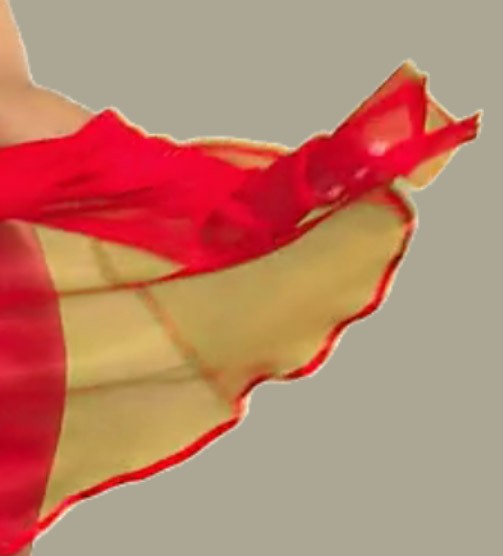
I believe that the adjustment takes several ranges of colours and applies a luminosity curve to each, adjusting each pixel depending how bright it is in the raw file. The curve adjusts saturation and contrast to improve the apearance. The program looks at each pixel in relation to it's neighbours, which I think is what sometimes produces a white line round the figure (see pic, which also illustrates how the greenscreen separation sometimes goes wrong with red transparent fabrics). It's all a bit more complicated than the shaders that we can run in our GPUs and Totem have grumbled about the enormous computing time associated with it. The raw file, if we tried to run it, would be significantly worse to view.
Note: all of the above may be rubbish - it's based on my limited researches of shaders and video post-processing rather than any inside knowledge.
rageinblack
已加入 在 Jul 2018 44 发布
July 30, 2018 (edited)
Oh, what debate has this become :D
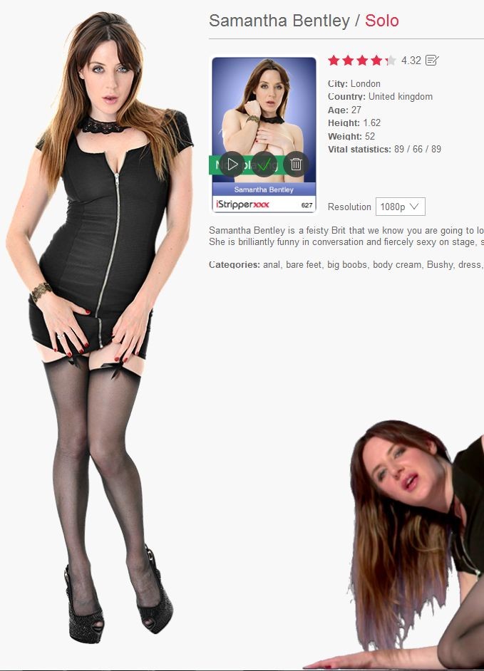
@gdavis thanks for supporting our cause :P I'm no expert of video editing but I worked a lot with photo editing and such. So at a laic level, I think I understand the basics, video, in the end, can't be so different to photo when it comes to adding simple things as brightness, contrast, saturation and such. I think if nothing else, and overlay filter or something could be applied over the model videos. I'm really missing the soft color tones, the middle ones because if a lingerie is black on the photo preview, in the video will be pitch black and lose quite some detail to it. Or the model's skin, for example in some instances a model looks much more attractive with brighter skin, an example would be Samantha Bentley. If you look at her only solo card, compare the preview to the actual thing. Wait I'll attach a screenshot. Just compare the color or her face, and that's at the very beginning on the clip...
@Pantalone yeah that sounds a like a logical process to do, semi-automatic and time-saving. Sometimes I notice the red lingerie especially that long skirt-like one when a model moves between her legs you can see the tiny-netted lingerie in that area turn slightly purple, it seems they were using a blue screen int that instance, most likely for its refractory qualities on that specific color of the fabric.
@Dorsai6 is there a special way to find out the new card of the day? or do you just browse the story by date?
Z22
已加入 在 Aug 2017 1166 发布
July 30, 2018
@rage, you could almost say it has become a mass debate.. :D
rageinblack
已加入 在 Jul 2018 44 发布
July 30, 2018 (edited)
@Z22 Yea :)
Sigh, I can't help it, I just love cyan color.
Sigh, I can't help it, I just love cyan color.
Z22
已加入 在 Aug 2017 1166 发布
July 30, 2018 (edited)
I did write a colour correction shader where it can isolate different colour clothing and the skintones and adjust them seperatly to get rid of the green tinted black clothing, purple toned red clothing, green toned blue clothing, olive toned skin(can make the girls look like donald trump.. lol). That shader can be found in my "re re 3d en" release and its called "recolour.fsh"
Additionally you can do multipoint colour rebalancing just before final output from a shader with ...eg:-
// float ColorROGOBO = start2 + (stop2 - start2) * ((value - start1) / (stop1 - start1)); //reference
// adjust midpoint
float ColorRO = 0.0 + (0.5 - 0.0) * ( (AdjR - (0.0) ) / (0.455 - (0.0) ) );
float ColorGO = 0.0 + (0.5 - 0.0) * ( (AdjG - (0.0) ) / (0.456 - (0.0) ) );
float ColorBO = 0.0 + (0.5 - 0.0) * ( (AdjB - (0.0) ) / (0.453 - (0.0) ) );
// adjust black/white point //should adjust mid to high then mid to low really. meh, sort it laterz.
float ColorRO2 = 0.0 + (1.0 - 0.0) * ( (ColorRO - (-0.01) ) / (1.0495 - (-0.01) ) );
float ColorGO2 = 0.0 + (1.0 - 0.0) * ( (ColorGO - (-0.01) ) / (1.0665 - (-0.01) ) );
float ColorBO2 = 0.0 + (1.0 - 0.0) * ( (ColorBO - (-0.01) ) / (1.014 - (-0.01) ) );
However the adjustments need to be different for the source res(240p,720p,1080p,3k) girls as they were shot with different cameras and probably went through a slightly different process.
The new 3k girls are another problem as they have a purple cast(have mentioned this in the correct these cards thread)
July 30, 2018
I'm not trying to put Totem down here. I know there's a lot of ***** that goes on in the forum, much of it unwarranted, but I genuinely feel this is an aspect that can be further improved. Totem usually seems pretty open to things we'd like to see improved, so why the attack on constructive criticism? I could have just said "ya, it sucks, they don't know what they are doing". But I didn't. Instead I provided some simple suggestions that I felt were overlooked and that would make a postive difference. Totem can do what they want with it, but I don't see the need to be defensive.
July 31, 2018
Just to give you all some idea of the effort that Totem and others make in trying to improve the colors of the animations, I'd like to share my thoughts.
I work in QA for Totem and so every card that I and others in QA review look at coloring and other aspects of the card and present our concerns to the Totem team. We in QA have all addressed the color problems that you all experience and the Totem team will respond to us by saying that it can't be improved any more or they will attempt to change the coloring and/or contrast/brightness of the animations. So there have been some cards that we have suggested a visual change and the Totem team has made adjustments to it before releasing the card. Therefore the team does in fact put in some effort in adjusting the animation's visual quality before QA receives them for review and sometimes changes it again after QA suggests that the coloring or brightness appears really bad.
Unfortunately, there is only so much that the team can do to improve on the visual quality given all the technical factors involved along with their limited time to work on it. The people working QA have learned what is considered reasonable and have a pretty good idea of what to expect as a compromise (thus realizing what probably can't be improved any more). However when we in QA see a visual quality that is bad enough and we feel that there is some chance that Totem can correct it, we report it in hopes that the Totem team will do so.
The Totem team puts more effort than most realize to get the best visual quality from the animations. Even so, we are always looking for ways to improve on them. Who knows what the future might bring as technology improves.
Z22
已加入 在 Aug 2017 1166 发布
July 31, 2018
I have no doubt totem put the work in and 1 new card a day with all the editing and additional art that needs to be done is appreiciated.
I can tell you of a few things that the present brings which would improve the throughput and quality but may take time to incorperate to the pipeline.
1. neural network masking, eliminates the need for blue/green screen and eliminates the radiosity problems they cause while giving much better alpha masks than is currently possible with automated process' . the girls holding up a pantone colour chart at the begining of the session wont be tinted by the blue/green screen either which will make it far easier to get accurate colouring.
2. neural network upscaling. A variant of srgan that can do video without causing flashing and upscale by 4x(has been around for 2 years now), speed dependant on gpu used. Can be trained on the vast collection of photo's totem has of the girls to make a specificly trained network, though the generic network does a fine job.
3. nural network optimised video compression. Better iq with the same filesize or same iq with smaller filesize(see google research)
4. Take a look at the deblocking function of ffmpeg as it appear to be off or incorectly configured atm(most noticable by block artifacts on jawline).
5. Something in the compression settings causes a tarten like glitch on the girls, most noticable on the hairline and when there is a red diagonal line. I have never seen this type of glitch in anything else.
6. A better realtime scaler than is currently used(linear/bilinear), Perhaps a bicubic hybrid catmul/bell would be better and not too costly cpu wise. The current one just blurs the c**p out of the girls at high resolutions because i can't preserve edges.
This is probably the simplest thing to impliment and give every card a boost in iq. (the 480p girls should be downscaled to their original 240p resolution too as scaling does not like 2x2 blocks unless they look that way because they have 3/4 of their data missing and they are actually 480p in which case they should be re-encoded with the missing data).
Thats just off the top of my head.
rageinblack
已加入 在 Jul 2018 44 发布
July 31, 2018 (edited)
Well, I must say that the newer cards are pretty good in terms of video quality, I can even see my beloved cyan color, in this card from 2015, it's still a bit greenish but almost there.
August 12, 2018

Thought I'd post this...
Filmed in front of a Blue Screen.
the Blue Hue of the Screen is Removed, and that Also Affects Blue in the Clothing color.
Since then, a New Process is being employed, and they might be using a Green Screen Now.
But blue is no longer a big problem.
Reflective surfaces still are a Big Issue.
Any time the Background color is reflected in the Shoes, jewelry, or the closes
it creates Hole..
There have been a few cards, that couldn't be released, because the Process, left the Model Looking like Swiss Cheese.
Not detected, until after it has been filmed and processed.
When it's too late to get the Model back to re-shoot it.
Pinks used to be a big problem, they came out looking very Orange.
Purples, also didn't work well... Depending on the Shade of purple, they came out Red or had Holes.
Navy Blues, came out almost Black
Blue Jean, often came out greenish.
So if you understand now, why there is a color difference..
A certain shade of Blue is Subtracted.
you can look at the card, and almost know right away, which outfits will not look
the same as their Photographed Stills.
Z22
已加入 在 Aug 2017 1166 发布
August 12, 2018 (edited)
As i said, they dont need a blue/green screen at all. This method eliminates the need for chromakeying and eliminates the problems caused by the radiosity of the screen.
https://www.youtube.com/watch?v=6DVng5JVuhI
links to the paper and github are in the about.
Several years ago disney made a presentation at siggraph(i think) about their greenscreen method which solves the swiss cheese problem, if i can find it again i will post a link.
Edit: https://www.youtube.com/watch?v=u22QPAp5rx0
August 13, 2018 (edited)
I'm not care much about the Colors of the Clothes , does not matter to me if it's blue or purple, i just want to see it on the Ground.
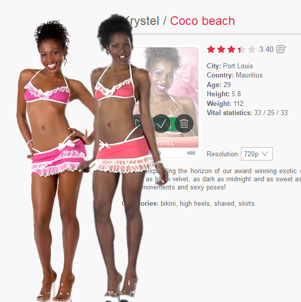
But the Contrast mostly on the 720p Cards could be better, the Card of Krystel up there is a prime example that these old cards are way too pale.
Isnt the iStripper software basically a Videoplayer? Shouldn't it be possible to implement a Slider for every Card to adjust the Contrast of the Output on our own?
meStripper
已加入 在 May 2018 23 发布
August 13, 2018
It would be nice to see clips as downloadable videos of the actual sequences on the blue/green screen
TheEmu
已加入 在 Jul 2012 3309 发布
August 13, 2018 (edited)
@meStripper - then just put up an all blue or all green background to get almost the exactly same effect. To increase the realism gave that background vary a little from place to place, e.g. using a photo of a real green screen or a screen capture from a video with such a scene. However, doing so would be uninterresting after a few seconds of viewing, as would Totem's original videos.
meStripper
已加入 在 May 2018 23 发布
August 13, 2018 (edited)
@theemu I have a plain background on my monitor for the girls to dance in while I browse reduced windows. I'd still think it would be nice to see the girls in their proper skin tones though, but it aint going to happen ;)
TheEmu
已加入 在 Jul 2012 3309 发布
August 13, 2018 (edited)
@meStripper
One of the things that has been brought out in this thread is that the original videos would not show the girls proper skin tones because of reflected light from the blue or green screens causes them to have a blueish or greenish tinge. I suppose that some sort of colour correction post processing could reduce that but not only would that entail extra work for little or no benefit to Totem it would also be likely to result in the same sort of problem that is being ***** about in this thread.
I'd still think it would be nice to see the girls in their proper skin tones though
One of the things that has been brought out in this thread is that the original videos would not show the girls proper skin tones because of reflected light from the blue or green screens causes them to have a blueish or greenish tinge. I suppose that some sort of colour correction post processing could reduce that but not only would that entail extra work for little or no benefit to Totem it would also be likely to result in the same sort of problem that is being ***** about in this thread.
您不允许参加!
作为iStripper 的免费用户,您不能在论坛中回答话题或创建新话题。
但您仍然可以访问基本类别并与我们的社区取得联系!