Age Verification
This website contains age-restricted material including nudity and explicit content. By entering, you confirm being at least 18 years old or the age of majority in the jurisdiction you are accessing the website from.
Our parental controls page explains how you can easily block access to this site.
0
Some observations and suggestions regarding iStripper Форум / Всё о iStripper
4 July 2016
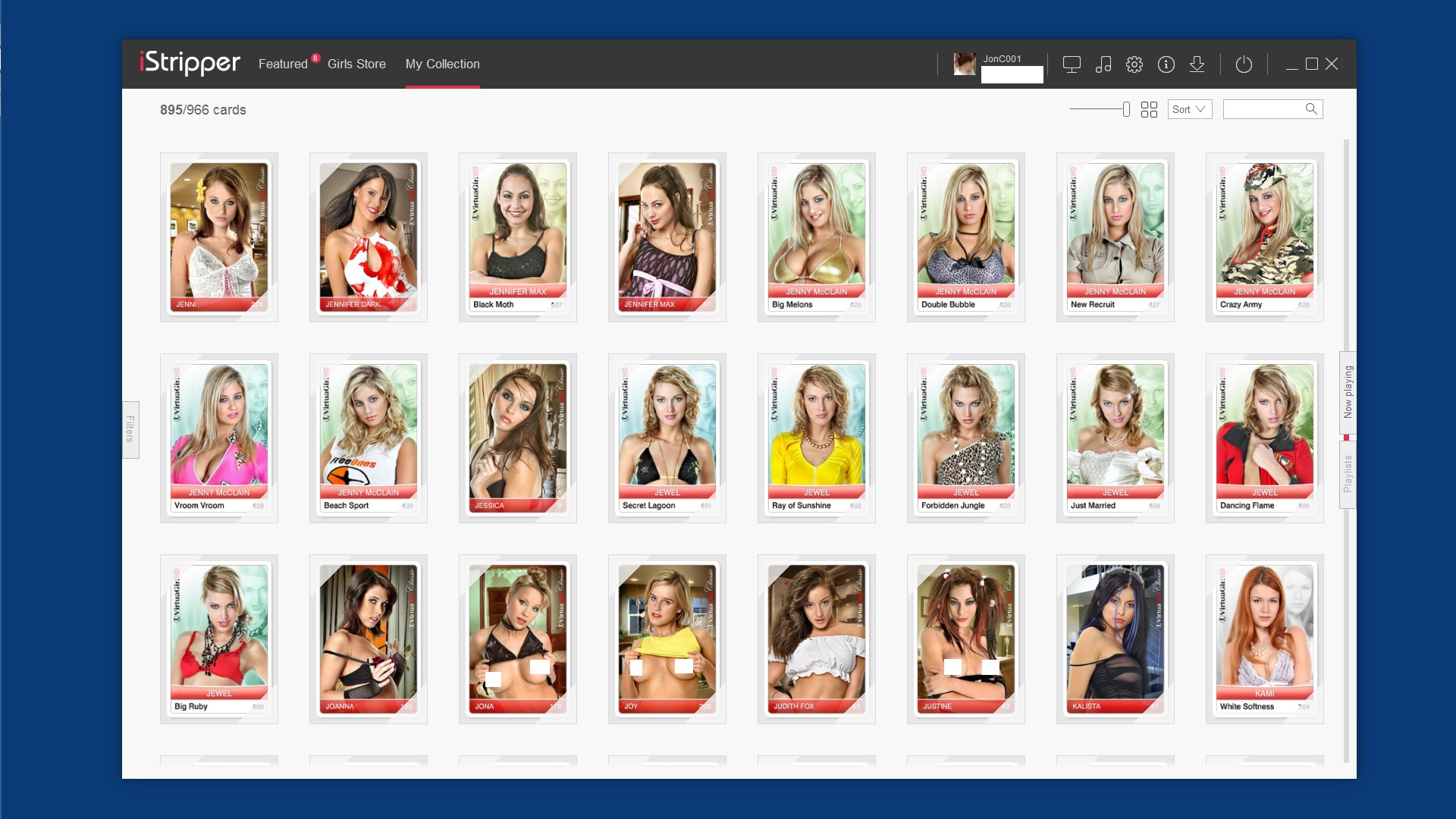
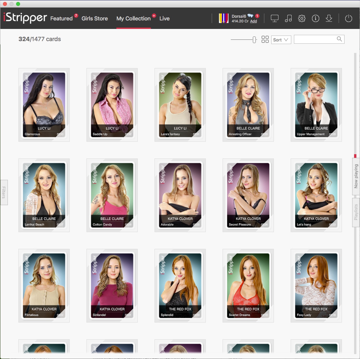
38) "Blank" cards on the "My collection" panel.
We are going to change that, but it’s not a priority.
39) Provide a higher level "Models" view of "My collection"
Same, it’s already in our list, but not at the top
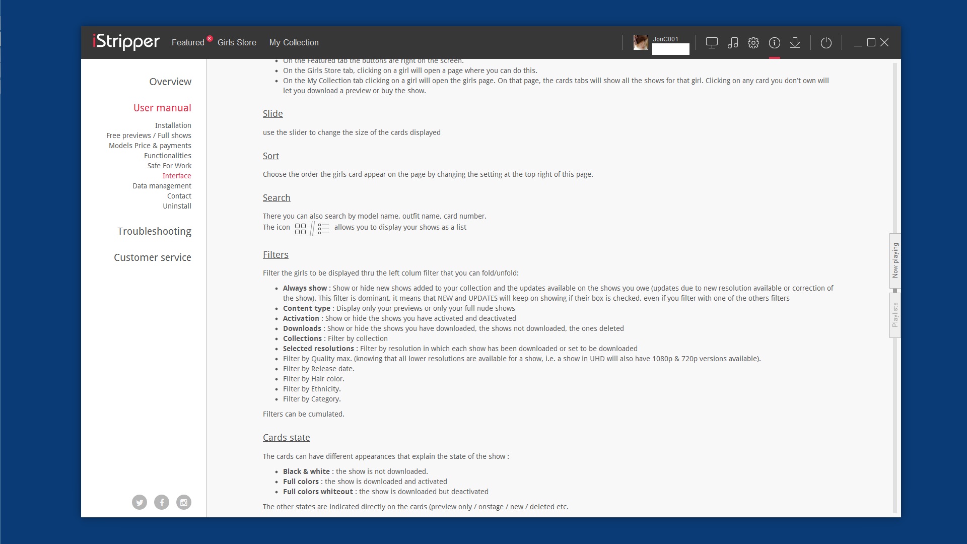
3) The iStripper window's "halo" is too wide.
It’s a bug and it’s not far in the list
4) Missing "tooltips"
We plan to add small (?) bullets everywhere, it’s mid list for now
5) Improve browsing of card details.
I’m not sure about this one, GUI is complicated enough already
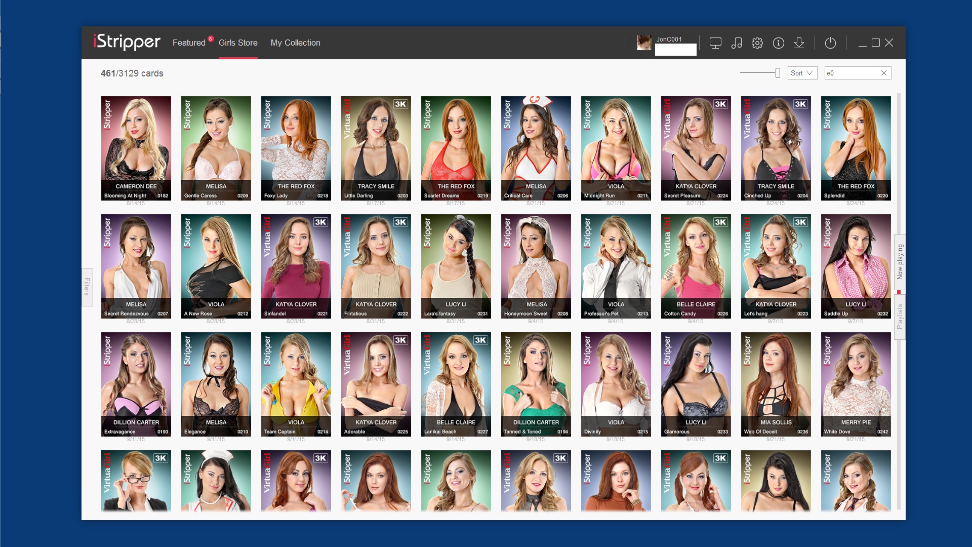
6) "My collection" and "Girls store" behaviour differences.
Uncheck the “Use slider console in store” checkbox in advanced settings
7) Explain the "Levels of erotisism" via a pop-up.
“Levels of erotisim do not reflect the average level of each clip, but the highest level reached in a clip. They are meant to be used to filter content on your desktop, for exemple to prevent anything more that topless to appear.” will be added to the manual
8) Add clip type restriction to the settings panel.
I added it to the backlog here but that’s not a priority given all the things to do already
9) A quick and obvious way to select/deselect all displayed cards is needed.
Why does the average user need to select all the card? Why Ctrl+A is not enough? I’m not a fan of adding one extra button per function in the software as is makes it more complicated.
10) Enabling or disabling all cards can take a long time.
I’ll have a look at it
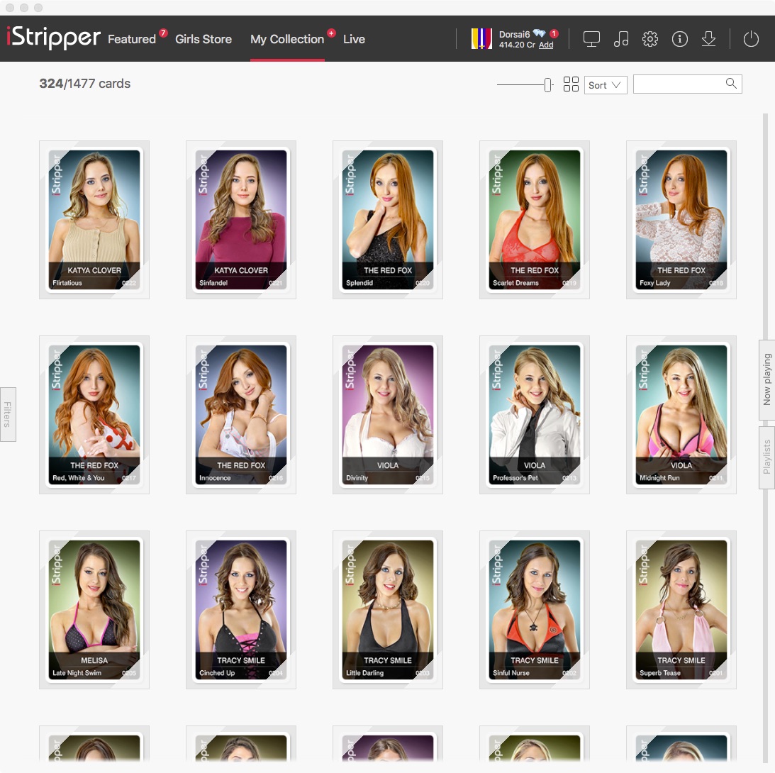
11) Problems when scrolling
We’re working on it
Do you mind posting a picture where the scrollbars at not visible? We don’t see that here.
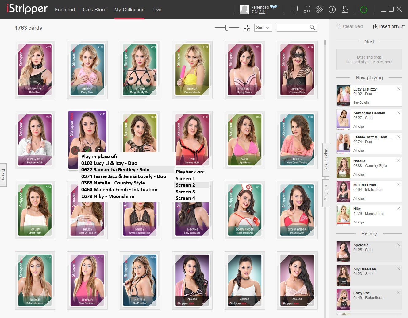
16) Support clip deletion and restoration via clip list panel.
Why not, but it’s not a priority as it implies managing the reload of deleted clips and that’s not so easy GUI wise.
17) Support both metric and English weights and measurements.
We’re using the settings of your OS. Could you please have a look and see if they differ?
18) Card details sub-panel tab labels or icons usage is inconsistant.
Not much we can do here as this is handled by QT
19) Clip durations can be too far from clip descriptions.
Not important enough for now
20) No continuity of the interface view between successive runs of the program.
Not important enough for now
21) The "Full screen" mode is poorly named.
Why not, what’s the other members take on the name of this?
22) Access to iStripper logs.
log files are for advanced users, we don’t want it in the GUI
23) Insufficiant information in some iStripper log messages.
We add more details in the log files when needed if we’re looking to fix something precise
24) iStripper attempts to use internet even when no connection is possible.
This is a very valid point but it’s not on top of the list for now
26) Clicking on an arrowhead on a carousel has no effect.
If you are referring to the arrow on the floor under the models, we have no plans to make them clickable
27) User defined "carousels".
They are tricky enough to manage on our side, we have no plan to let users customise them for now
28) Provide a way to spin a carousel.
Fun but not for now
29) User defined card and clip attributes.
I like this one as well, but it’s not a priority
30) Optionaly increase the apparent thickness of the Windows task bar.
Obviously we have an issue with the size of that bar that needs to be fixed. But it won’t be customisable.
31) Data download folders.
Why not
32) Viewing forum posts.
We have no plans to provide tabs in the software when browsing the forum for now
33) Card rating system.
We’re working to improve the card rating system as well as the feedback on quality, technical issues etc on each card
34) List of available music
Music GUI has to be updated, but it’s not top of list for now
35) Associating particular music with a card
This will possible using playlist. You’ll be able to ***** and drop music in the playlists in the future.
37) Display of current downloads
We’re trying to keep the download pull down simple
12) Extra information for the main details panel.
Yes, let me see where that can be added
13) Clip numbering is *****.
No time to go back on this for now
14) Show clip numbers in "Now playing".
More information is not always better, I, don’t want this to get too clumsy
We are going to change that, but it’s not a priority.
39) Provide a higher level "Models" view of "My collection"
Same, it’s already in our list, but not at the top
3) The iStripper window's "halo" is too wide.
It’s a bug and it’s not far in the list
4) Missing "tooltips"
We plan to add small (?) bullets everywhere, it’s mid list for now
5) Improve browsing of card details.
I’m not sure about this one, GUI is complicated enough already
6) "My collection" and "Girls store" behaviour differences.
Uncheck the “Use slider console in store” checkbox in advanced settings
7) Explain the "Levels of erotisism" via a pop-up.
“Levels of erotisim do not reflect the average level of each clip, but the highest level reached in a clip. They are meant to be used to filter content on your desktop, for exemple to prevent anything more that topless to appear.” will be added to the manual
8) Add clip type restriction to the settings panel.
I added it to the backlog here but that’s not a priority given all the things to do already
9) A quick and obvious way to select/deselect all displayed cards is needed.
Why does the average user need to select all the card? Why Ctrl+A is not enough? I’m not a fan of adding one extra button per function in the software as is makes it more complicated.
10) Enabling or disabling all cards can take a long time.
I’ll have a look at it
11) Problems when scrolling
We’re working on it
Do you mind posting a picture where the scrollbars at not visible? We don’t see that here.
16) Support clip deletion and restoration via clip list panel.
Why not, but it’s not a priority as it implies managing the reload of deleted clips and that’s not so easy GUI wise.
17) Support both metric and English weights and measurements.
We’re using the settings of your OS. Could you please have a look and see if they differ?
18) Card details sub-panel tab labels or icons usage is inconsistant.
Not much we can do here as this is handled by QT
19) Clip durations can be too far from clip descriptions.
Not important enough for now
20) No continuity of the interface view between successive runs of the program.
Not important enough for now
21) The "Full screen" mode is poorly named.
Why not, what’s the other members take on the name of this?
22) Access to iStripper logs.
log files are for advanced users, we don’t want it in the GUI
23) Insufficiant information in some iStripper log messages.
We add more details in the log files when needed if we’re looking to fix something precise
24) iStripper attempts to use internet even when no connection is possible.
This is a very valid point but it’s not on top of the list for now
26) Clicking on an arrowhead on a carousel has no effect.
If you are referring to the arrow on the floor under the models, we have no plans to make them clickable
27) User defined "carousels".
They are tricky enough to manage on our side, we have no plan to let users customise them for now
28) Provide a way to spin a carousel.
Fun but not for now
29) User defined card and clip attributes.
I like this one as well, but it’s not a priority
30) Optionaly increase the apparent thickness of the Windows task bar.
Obviously we have an issue with the size of that bar that needs to be fixed. But it won’t be customisable.
31) Data download folders.
Why not
32) Viewing forum posts.
We have no plans to provide tabs in the software when browsing the forum for now
33) Card rating system.
We’re working to improve the card rating system as well as the feedback on quality, technical issues etc on each card
34) List of available music
Music GUI has to be updated, but it’s not top of list for now
35) Associating particular music with a card
This will possible using playlist. You’ll be able to ***** and drop music in the playlists in the future.
37) Display of current downloads
We’re trying to keep the download pull down simple
12) Extra information for the main details panel.
Yes, let me see where that can be added
13) Clip numbering is *****.
No time to go back on this for now
14) Show clip numbers in "Now playing".
More information is not always better, I, don’t want this to get too clumsy
TheEmu
Присоединился в Jul 2012 3309 Сообщения
4 July 2016
@Rex
Thank you for your quick reply, and amy very happy that many of the points raised are already in hand. Several of the others were simply things that you might consider at some point of time in the future.
With regard to point 5) it really is very awkward at the moment to look at the details of a number of girls requiring many mouse clicks to do very simple things. Other users have already commented on this and, and I presume they, would greatlly appreciate it if it could be made easier.
With regard to 7) I know what the levels of eroticism are, but the names are still ***** and ought to be explained to new users, preferably without them having to read a manual because far to may people don't bother to read them anyway. A simple pop-up on a help button labelled [?] would eliminate a lot of *****.
With regard to 9) I have no problem with using control-A, but judging from posts from other users it was not obvious to them and some have laboriously selected every card individualy. As I said the method should preferably be obvious, not just available if you know about it.
For 17) my OS setting is metric, and that is what I want for most programs, but not for the girls vital statistics and height. I think you should defalt to the OS setting, but allow it to be overriden.
For 21) "Full screen" is an accurate name for how you implement the mode but it is equally applicable, and arguably more applicable, to the mode in which you show a single girl on the desktop. Its an implementation detail, not a user level thing. For a user the more important aspect is that they are "scenes" irrespective of whether they are full screen or not. There is nothing inherent in "scenes" that requires full screen and they could equally well be shown in a resizable window much as you do for the previews. Any such change would, of course, be for the distant future but it would then certainly be wrong to call them full screen.
For 23) it would help greatly if any time a message was logged there was an indication of the card or clip and, if applicable, the .scn file. This information could be on a secondary message which, assuing that you have a central error message logger, was automatically generated when any error was logged. As it is I have a log with lots of error messages about problems in various .scn files but have no idea which .scn files they were. Alternatively a single message every time a new scene is started would help even though there might be a lot of them.
For 24) I was refering to the arrowheads. When I first saw the ne carrousels I thought that they were meant to be how you rotated it and it took me some time to find out how it was supposed to used. I take the view that if I can make a mistake like this then so can other new users.
28) was indeed just intended as a fun feature.
29) Tabs for the forum would be nice, but I can always use the website instead.
30) The only real problem with the download list was when I was downloading a lot of new cards (20 or 30 of them) and found it hard to find which were currently being downloaded. The other things I mentioned with just nice to have features, similar to equivalent features in the Firefox downloads list.
14) I agree that more information is not always better, but as you will see from a couple of bug reports I recently posted I have encountered problems regarding what clips are played and in waht order, so perhaps I am a bit over sensiive to this lack of data. I still think it would be a good idea as long as it was kept neat.
4 July 2016 (edited)
Rex said this in response to an earlier post:
Please view screenshots.
The red bar is visible between tabs in the my collection and the store. But it goes into hiding as I am sure you can see when scrolled up or down.
The dark gray bar is visible between tabs in the help user manual. This will also go into hiding when scrolled up or down.
11) Problems when scrollingThis is what I see.
We’re working on it
Do you mind posting a picture where the scrollbars at not visible? We don’t see that here.
Please view screenshots.
The red bar is visible between tabs in the my collection and the store. But it goes into hiding as I am sure you can see when scrolled up or down.
The dark gray bar is visible between tabs in the help user manual. This will also go into hiding when scrolled up or down.
TheEmu
Присоединился в Jul 2012 3309 Сообщения
4 July 2016
@JonC001
Thank you for posting the screen captues, I have been unable to find where Microsoft have hidden the screen capture feature in Windows 10 though I know its here somewhere
@Rex
JonC001's screen captures show the main problem. There are also tmes when no scroll bar are visible at all, but it becomes visible when the mousepointer is in the panel with the scroll bar. At first I thought the pointer had to be on the scroll bar itself, but that is because I was bringing it in from the side so the first thing it reached was the scroll bar.
4 July 2016 (edited)
From the Mac beta 115. Cap 1 shows scroll bar just visible above the Now Playing tab. Cap 2 shows it hidden behind the tab. Placing any control on top of another is bad design. Sometime bad design is necessary, but not in this case.
Edit: Cap 2 is on top
Edit: Cap 2 is on top
4 July 2016
21) The "Full screen" mode is poorly named.Since they were first used in VG, I've felt that Large mode, Small mode and Full Screen were poorly named. I would have called them Single Card, Multi-Card and Custom Background. However, the current names are distinct and not a big issue for me.
Why not, what’s the other members take on the name of this?
This is the kind of issue where Totem would benefit by asking the community for comments and feedback during the early stages of design long before things are coded. It is also an area where language differences should be addressed with the user community.
DANO70
Присоединился в Feb 2008 742 Сообщения
4 July 2016 (edited)
@The Emu
There's a screen capture app in windows 10 called "snipping tool", That's what I've used. I don't know of another default one. You can find the app under "All apps / windows accessories"
There's a screen capture app in windows 10 called "snipping tool", That's what I've used. I don't know of another default one. You can find the app under "All apps / windows accessories"
xextended
Присоединился в Mar 2015 30 Сообщения
5 July 2016
...not ones that says ERROR, but one that gently explains "I can not do xxxxx because yyyyy".
Well we can agree that nowadays programmers are far to lazy to make such big effort ;)
They also share common love to magic codes, without clear, easy understandeable explanation...
xextended
Присоединился в Mar 2015 30 Сообщения
5 July 2016
I have been unable to find where Microsoft have hidden the screen capture feature in Windows 10 though I know its here somewhere
Just click "print screen" button on keyboard and it will copy a screenshot so you can paste it for example into paint.
xextended
Присоединился в Mar 2015 30 Сообщения
5 July 2016 (edited)
@TheEmu @Rex
But regarding more or less cosmetic changes mentioned above I would kindly ask to add such level of controls (or advanced option for power users to enable such feature in settings) in not so distant future.
I think it will improve the overall usage. The second level menu with target screen selection should be disabled by default on single screen setup.
5 July 2016
Well we can agree that nowadays programmers are far to lazy to make such big effort ;)HOT BUTTON ISSUE:
They also share common love to magic codes, without clear, easy understandeable explanation...http://www.virtuagirl.com/forumPost.php?foId=3&ftId=33363&gotolastpage=1#post504096Всё о iStripper / Some observations and suggestions regarding iStripper38) "Blank" cards on the "My collection" panel. On the "My collection" panel some cards, namely those which Totem can no longer sell such as those for Alizee or Miss Roxx, are displayed either as blan...
They may be writing code and they may be paid for it, but I don't like to call them programmers. Programmers should consider the usability and maintainability of the code they write.
You're right that adding usability features adds to the expense of software and I've occasionally left out such features when operating under a deadline, but it is unprofessional. My ideal error message should tell the user enough in terms the user can understand to allow the user to correct the problem. I know that can not always be done, but I think it is a goal worth keeping in mind.
Wintergreen
Присоединился в Mar 2013 35 Сообщения
5 July 2016 (edited)
28) Provide a way to spin a carousel.Use the keyboard. Left and right arrow moves the carousel. Hold one of them down and auto-repeat will spin the carousel. After a few seconds release the key. The carousel will shortly stop spinning. I doubt that any human can predict where it will stop.
Fun but not for now
I just noticed... mouse wheel works too. But the keyboard solution is better.
5 July 2016
Programmers, or as I like to call them (after a former mod, gave me the term) code poets are people just like the rest of us.
They have a job to do and depending on who they work for, have a degree of freedom as to how much they can improvise.
Where I currently work, they want all staff to spend 20% of their tie researching new ways of doing it. Unfortunately their retoric is not matched by their actual deeds. Its just get the job done in the smallest amount of time.
I remember Regi, the former programmer here and he had liitle time to consider alternatives......
goldiecharleston
Присоединился в Dec 2008 340 Сообщения
5 July 2016
It's not a question of programmers being lazy by using ERROR 401 or ERROR 400 for example. The fact is whatever they write in has to be translated easily, more importantly the user can relay this pertinent information to the support Team to expedite the resolution of Technical Issues.
xextended
Присоединился в Mar 2015 30 Сообщения
6 July 2016 (edited)
@Cartref
About programmers I could write a book or even two... ;)
I made good money for about a decade simply translating end users (customers) wishes into GUI I designed plus structure and list of things to do for me and back list of can do/cannot be done cheap/fast. And I met programmers coding in the way even I could modify with ease later and others that if I would show you examples you wouldn't... It is usually seen how somebody makes notes. One is scratching everything all over the page one on another in all directions that he will (maybe) be the one to decipher it and the other will note it properly.
Code poets are making very good quality coding even in hurry because it is a habit for them (or as very high class programmer told me 20 yars ago - it is not paying well not to do it - it is necessity in large projects when dozens or hundreds of people collaborate), They are aware if they will make it messy they will loose more time to add some modifications than to write everything from the scratch.
I know that times are different. Everything must be faster. So it is - you are testing it for yourself everyday using Vista/7/8/10 when they shifted from programming in C++ (very good compiled apps with usually low hardware reqs) into .Net and other even worse interpreted (but fast) soilutions like C#. That is main reason why nowadays most aof pps is so memory and processor hungry - your PC is actually doing live interpretation of code which costs like hell - then you have usually couple of those special platforms (enviroments) - JAVA, .Net, Silverlight, C#, VBS - each of them were used in the past for some small apps not such large projects like nowadays simply because new generation of programmers never had to worry about every signle kB or RAM, they just write and compile and use fancy tools to evaluate if it's OK or not. The you open your new printer box and see driver having 200 MB + 1 GB of garbage added instead of 5-20 MB of whats really necessary...
@goldiecharleston
As Emu said - not every error is really an error. Maybe I do not totally agree with his exact point of view on this matter then I cannot say there is no logic in showing warning "No Internet connection" instead of showing program error code which usually is error class more like windows exception code on blue screen of death and reason to really worry...
Error would be actually with Internet connection OK if iS wouldn't be able to log you on iS server.
But iS is showing me error almost every time I am browsing this forum because the time preset in software to make the connection is to short for my mobile - LTE access for example.
TheEmu
Присоединился в Jul 2012 3309 Сообщения
30 July 2016 (edited)
Now that I have a few, very few, days of full net access here are a few extra, mostly very *****, additions to my list of Observation and Suggestions. Only the first of these causes any real problem.
42) Downloads can block some interactive use of the software.
I am in the middle of downloading many of the iStripper videos as I have got behind with my collection of them. As a result I have often had 6 active downloads with up to anther 8 queued (the peak so far was after adding Belle Claire's 10 solo videos). With 6 active downloads any attempt to switch to looking at the comments or list of videos for another card results in a a "busy spinner" and a "loading..." message which lasts until a few seconds after the number of active downloads drops to 5. This blocking of interactive use by what ought to be the background process of downloading can last for several minutes. This can even block any use of the forum and result in error messages and requests to check your internet connection. Although in my case it did not matter because what I was doing interactively was just going to the next set of videos to download it is generaly not a good idea if the interactive part of any program is blocked by background activities like this. Please prioritise the interactive use even if this means reducing the number of downloads that can be simultaneously active.
43) The meaning of the download manager's "Remove all" is not immediately obvious.
"Remove all" could mean "Remove everything", "Remove all completed downloads" or "Remove all succesfully completed downloads". I thought that it probably meant the third of these but I was wary of using it while any download was active in case it meant the first. The fact that it was a red button, which often means "danger" or "stop", probably added to the slight anxiety that I felt about using it. It would, I feel, be better if the button was labeled differently, e.g. "Clean this list", and if it was not coloured red. I assume that an explanatory tool-tip will be added soon and this should remove any ambiguity.
However, and more important, is the fact that the action of pressing "Remove all" is "Remove all completed downloads" even if they failed. This means that any indication of a failed download may be removed before it is seen as it won't necessarily be visible in the list of downloads if it is not one of the few visible without scrolling. Can you please only remove successfully completed downloads when "Remove all" is pressed.
44) No "close" or "return" button on the license page.
Pressing "Show license" displays the license text, but is no explict "close" or "return" button. Pressing the "Settings" icon has the required effect of return to the settings page but it "doesn't feel quite right" its the difference between returnig to somewhere goingon to somewhere that just happens to be where you came from). I feel that the license should be displayed in a pop-up window with a close button. This isn't at all important, but it still feels wrong to me.
45) No feedback when pressing "Check for updates"
On pressing the "Check for updates" button on the setting panel there is no feedback if there are none available (I assume there would be feedback if an update way available). If there is no update available it would be better to explicitly indicate this rathere than just do nothing. Again, this is not very important but without the feedback you do not know whether the check was made or not or if the button really had been pressed.
46) Current card shown faded in a card's card list.
On the cards list panel for a card the current card is shown partialy faded, presumably to indicate that you can't "go to" it because you are already there. However, it think it would be more appropriate to highlight that card as being the current card. Currently it looks as if there is a problem with the card when there is not.
Вам ещё не разрешается участвовать
Будучи бесплатным пользователем iStripper, вам не разрешается отвечать на форуме или же создавать новую тему.
Но вы можете просмотреть основные категории форума или познакомиться с его участниками !