Age Verification
This website contains age-restricted material including nudity and explicit content. By entering, you confirm being at least 18 years old or the age of majority in the jurisdiction you are accessing the website from.
Our parental controls page explains how you can easily block access to this site.
0
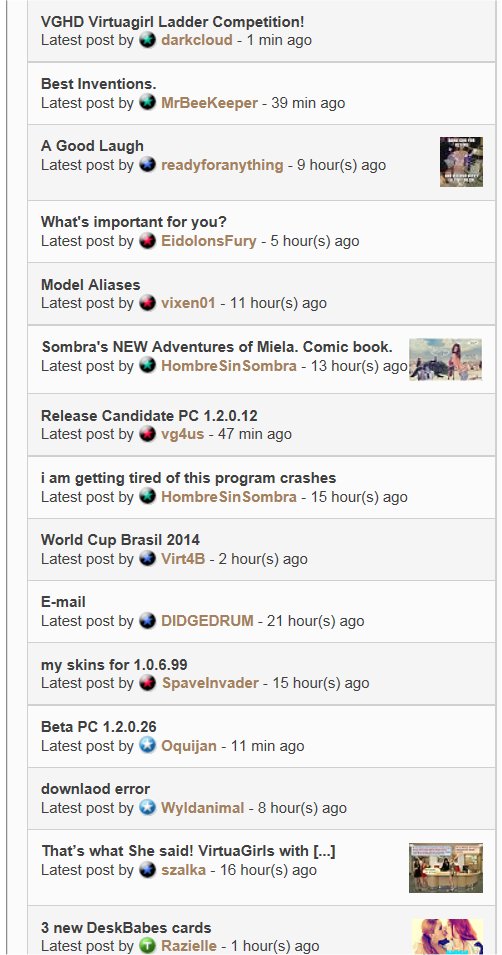
New Star System Форум / Всё о iStripper
shodan084
Присоединился в Dec 2007 1652 Сообщения
9 July 2014
Everybody has new stars... I like it!
Going to have get used to identifying team by new colours...;)
Going to have get used to identifying team by new colours...;)
MrBeeKeeper
Присоединился в Jul 2012 293 Сообщения
9 July 2014
Yep, but would be helpful if someone from the Team would introduce officially all the changes that accompany these levels. Right now it looks just good and nothing more.
DMon1981
Присоединился в Jan 2010 385 Сообщения
9 July 2014 (edited)
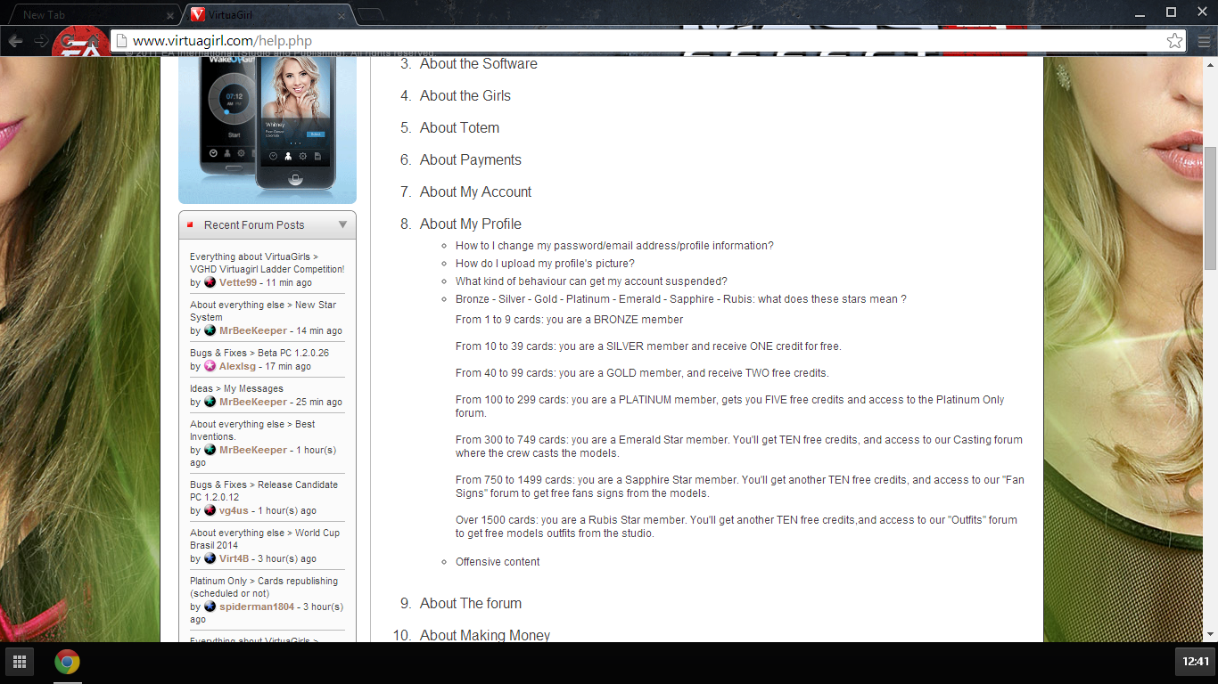
Here are the new meanings of the stars.
I like the new stars, may take some getting used too. ;-D
I like the new stars, may take some getting used too. ;-D
MrBeeKeeper
Присоединился в Jul 2012 293 Сообщения
9 July 2014
Thanks, DMon! As always the Help section tends to be forgotten ..
However, are these ALL the changes, or perhaps is there something else related?
Asking, 'cos ran into a small messaging problem today, which I wasn't prepared to - 35 messages made both: Inbox and Sent full .. never happened before.
However, are these ALL the changes, or perhaps is there something else related?
Asking, 'cos ran into a small messaging problem today, which I wasn't prepared to - 35 messages made both: Inbox and Sent full .. never happened before.
DMon1981
Присоединился в Jan 2010 385 Сообщения
9 July 2014
That is beyond my knowledge as I get and send very few messages, and every now and then I clean them out, so have never reached any sort of limit.
jununger
Присоединился в Oct 2007 1243 Сообщения
9 July 2014
Now this is an interesting piece of text:
"and access to our 'Outfits' forum to get free models outfits from the studio"
It's about the rubyStar level and the text is found under the Help-section.
What does this mean? Will we be given free model outfits? Sounds to good to be true =)
"and access to our 'Outfits' forum to get free models outfits from the studio"
It's about the rubyStar level and the text is found under the Help-section.
What does this mean? Will we be given free model outfits? Sounds to good to be true =)
Oquijan
Присоединился в May 2009 1536 Сообщения
9 July 2014 (edited)
Surely there will be some mechanics to win those outfits. As is rather impossible to get one for everybody, unless they cut them into very tiny pieces. In that case, shotgun for a button, lol.
jununger
Присоединился в Oct 2007 1243 Сообщения
9 July 2014
Ah, that sounds like a logical explanation =) ...I guess the Team will explain in due time.
Grog101
Присоединился в Apr 2014 167 Сообщения
9 July 2014
are we still going to have auctions? for plat. members and ^
The3LeggedMan
Присоединился в Feb 2010 369 Сообщения
10 July 2014
Woooooooooooooooo I'm an emerald star! I was worried I'd be a crappy topaz or some other worthless gem. Wow Grog, you're a diamond star! You must have the whole collection.
jununger
Присоединился в Oct 2007 1243 Сообщения
10 July 2014
Actually that's not diamond but platinum. RubyStar is the highest for members with more than 1500 cards. See DMon1981's post above. =)
Going to be interesting to see what these new levels will bring.
Going to be interesting to see what these new levels will bring.
The3LeggedMan
Присоединился в Feb 2010 369 Сообщения
10 July 2014
Yeah those fan signs seem interesting. I don't care much for the outfits, I can't see myself in stockings and a lace bra. Oh man, still got a long way to go..
notdeadyet
Присоединился в Feb 2012 143 Сообщения
10 July 2014
Well im totally baffled
Hemingford
Присоединился в Oct 2013 178 Сообщения
10 July 2014
Saw it yesterday. Nice colors. Will take a little time getting used to this though.
tyqi19my
Присоединился в Dec 2007 27 Сообщения
10 July 2014
I think the graphic artist who did the member symbols must have been ***** when aesthetics was presented at school.
I think the black background in the icon dominates and makes it look ugly. And, I need a magnifying glass to see the star in the middle when black background is dissonate with the foreground star colour. My eyes must be deteriorating with age.
The reversal colours we see in the moderators and Totem staff icons are much clearer and aesthetically more pleasing.
Ah well, you can seem to please everyone....
DIDGEDRUM
Присоединился в Mar 2008 2336 Сообщения
10 July 2014
Yes, it is are raining not here also !...
peterbanker
Присоединился в Jan 2009 224 Сообщения
10 July 2014
As VGHD is still showing me as a red VIP member, just posting this to see what my new star looks like.
goldiecharleston
Присоединился в Dec 2008 340 Сообщения
10 July 2014
Seems to be a fair system. I made Emerald by the looks of it. Casting threads still accessible which is nice.
Bad4Good
Присоединился в Jan 2012 74 Сообщения
10 July 2014
Agree with tyqi19my. The star graphics should be a white star on a background of the appropriate level colour. The current graphic is not clear enough.
11 July 2014
Don't wanna get into a battle here but I can see the new stars/colours just fine. I actually like the coloured star on a black bg. On a laptop, maybe it's a little difficult to see but on a large TV/monitor, no prob :)
Having said that, I guess Totem should cater to everyone's capabilities/hardware. Can't please everyone all the time, I guess :(
Having said that, I guess Totem should cater to everyone's capabilities/hardware. Can't please everyone all the time, I guess :(
MrBeeKeeper
Присоединился в Jul 2012 293 Сообщения
11 July 2014
Another way would have been to put a black badge with a star in to a colored circle, but guess it's too late for any kind of suggestions and ideas ..
Actually I like these new Diamond levels .. as I've been always thinking green .. };-)
Actually I like these new Diamond levels .. as I've been always thinking green .. };-)
11 July 2014 (edited)
I have to agree the black background with the colored star inside it doesn't work. On my 27" monitor at 1920 x 1080, my blue "Sapphire" star hardly shows up in it against the black background. Even with my old "VIP" button/star combo where the button is red and the star is white in it, the "shape" of the star isn't very clear, but at least you can tell the button's color for sure.
I'm assuming the buttons are just a "graphic", so it shouldn't be too hard or time consuming to change them. The "design" is already there...the colors would just need to be changed for the button and the stars. But black with any other "darker" color never does provide a good contrast between the two colors. The opposite is true too...white and a light yellow never provide a good contrast.
I'm assuming the buttons are just a "graphic", so it shouldn't be too hard or time consuming to change them. The "design" is already there...the colors would just need to be changed for the button and the stars. But black with any other "darker" color never does provide a good contrast between the two colors. The opposite is true too...white and a light yellow never provide a good contrast.
11 July 2014 (edited)
The new Star system went online a bit early, I'll post the official news about it in the coming days. Graphics and/or names will probably be tuned to ease the reading and understanding of the icons and levels.
New forum categories "Fan Signs" and "Free Outfits" will be created soon. They'll be readible by all Stars members, but you'll have to be Sapphire to get fan signs and Ruby to get free outfits. Winners will be selected randmly among members interested.
New forum categories "Fan Signs" and "Free Outfits" will be created soon. They'll be readible by all Stars members, but you'll have to be Sapphire to get fan signs and Ruby to get free outfits. Winners will be selected randmly among members interested.
Ironman79
Присоединился в Dec 2010 439 Сообщения
11 July 2014
Smooth move Totem to be considered for the "free outfits" i would have to bite the bullet and get cards i never thought i would be getting since i have to have 1500.
shodan084
Присоединился в Dec 2007 1652 Сообщения
11 July 2014
Not overly interested in outfits, but the fan sign does sound... intriguing! (Teaching the girls semaphore are you???;)
An idea for a card there... Codename; sex signals :)
An idea for a card there... Codename; sex signals :)
jununger
Присоединился в Oct 2007 1243 Сообщения
11 July 2014
@Hombre
Watch out he might bite! =)
@REX
Thanks for the info REX. Looking forward to learning more about these changes. There's a lot going on now with the new price plan, stars and content changes. Going to be an interesting fall here at VG.
Cheers! =)
Watch out he might bite! =)
@REX
Thanks for the info REX. Looking forward to learning more about these changes. There's a lot going on now with the new price plan, stars and content changes. Going to be an interesting fall here at VG.
Cheers! =)
snake353solid
Присоединился в Aug 2009 312 Сообщения
11 July 2014
@Rex
Thanks a lot for the info.I am impatient to learn more about the new sytem, I hope to still enjoy all like before ;)
Greetings to all :)
Thanks a lot for the info.I am impatient to learn more about the new sytem, I hope to still enjoy all like before ;)
Greetings to all :)
11 July 2014
@Jununger: With very powerful jaws and teeth! ;) I meant zero offence. I couldn't help but notice the new stars and letters for the team and mods. Come on, "T REX?" I'm thinking Rex did this deliberately to show who's the boss! :) Go Rex! Whether you meant it or not, I thought it was funny :) Thanks for having a sense of humour.
Вам ещё не разрешается участвовать
Будучи бесплатным пользователем iStripper, вам не разрешается отвечать на форуме или же создавать новую тему.
Но вы можете просмотреть основные категории форума или познакомиться с его участниками !