Age Verification
This website contains age-restricted material including nudity and explicit content. By entering, you confirm being at least 18 years old or the age of majority in the jurisdiction you are accessing the website from.
Our parental controls page explains how you can easily block access to this site.
0
iStripper 2.0 - Reveal #5 - The Girl view 掲示板 / iStripperに関する全て
September 4, 2024
Give it a try! Now the store and your collection can be watched with a carrousel!
Check out this video done by our great Wyldanimal https://virtuastripper.net/video/Girl-View-001.mp4
Open iStripper settings, scroll to the very bottom and select 'Beta' instead of 'Stable'.
Give us your feedback !
Check out this video done by our great Wyldanimal https://virtuastripper.net/video/Girl-View-001.mp4
Open iStripper settings, scroll to the very bottom and select 'Beta' instead of 'Stable'.
Give us your feedback !
abcdef6
Joined in Apr 2008 4 投稿
September 4, 2024 (edited)
I liked the carrousel back in the day so I gave the iStripper 2.0 another go... and I like it much more than when I tried it for the first time :) I needed some getting used to the new interface and it seems much more intuitive now.
Two gripes though:
Two gripes though:
- I'd like to have to Previews tab back (it could be added under Store or Collection tabs) so that I can see what "demos" from the free preview push I have currently available and for how much longer the flash sale for them lasts.
- Slow motion gets disabled when I play another show from the queue. It doesn't happen when do it in different way, e.g. directly from girl's card or via context menu.
KingVCrimson
Joined in Dec 2019 18 投稿
September 4, 2024
Still using the original app since all my old playlists run backwards using the new app.
I will join once that is fix or continue using the old app.
iSt team please include a reverse order option for the old playlists uding the new app.
I will join once that is fix or continue using the old app.
iSt team please include a reverse order option for the old playlists uding the new app.
September 4, 2024
I finally updated to beta version and while I haven't explored much yet, this carousel looks really nice! 👍 I'm happy that it was "restored".
E.g. when collection is sorted by purchase date, it is a nice way to browse through your latest shows just by using your mouse's scroll wheel.
I also like the fact that the top banners on home tab don't scale to whole width of the monitor.
E.g. when collection is sorted by purchase date, it is a nice way to browse through your latest shows just by using your mouse's scroll wheel.
I also like the fact that the top banners on home tab don't scale to whole width of the monitor.
September 4, 2024
iSt team please include a reverse order option for the old playlists uding the new app.
I second this request. I also have tons of old playlists created using different criteria, and they are now playing from end to start and not the way they I intended.
riurg
Joined in May 2013 6 投稿
September 4, 2024
Back to the carrousel is good, but what about the PREVIEWS ? the dissable function doesn´t work for me. Whenever I start istripper a dozen preview models appear that I DON´T WANT TO SEE ! and there is no way of stopping this. Is this only happening to me ? please advise...
riurg
Joined in May 2013 6 投稿
September 4, 2024
also toggling between Beta and Stable doesn´t work, to get back to stable I have re-install the older version. If of help I use MAC with latest Sonoma 14.4.1
Jaipee
Joined in Jan 2022 48 投稿
September 4, 2024 (edited)
Very happy to see the carrousel back as shown in the video...
On my 2nd pc, I still have the last version using the Carrousel, but it is for models in the shop, not like here, showing your own cards...
Just 1 little thing, concerning the way to filter. I see that the demo was with the selection "Bikini + Body Cream".
It is nice to see that you can combine criteria!
But, still the same missing filter, and using 3 states, not 2 (on/off). It means that you should, for all filters, have the possibility to have the 3rd state, equivalent to the "no" logic,
Example, I want ladies with Bikini and Body Cream, but NOT with Big Boobs (the criteria just above):
I should be able to unselect this option if it has 3 possible states and it creates my own sql...
... and rather than the "and" operator, how can I have the "or" ? Or is it a "or" in the video, bikini or body cream tags ?
LZH11
Joined in Jul 2016 2 投稿
September 5, 2024
I like the carousel, but I can't find the clips list in the new version.
cfrec2
Joined in Mar 2012 51 投稿
September 5, 2024 (edited)
main reason im not updating to 2.0 is the playlist "bug".
i REALLY don't wanna have to redo 400+ playlists.
brucebannr
Joined in Mar 2020 5 投稿
September 5, 2024
It is hard to understand why did you dumped old UI. that was so much attractive to New Users. Specially the various catagory carrousel, the preview section. This what caught my attention when saw it first time. It gave 3D feelings back then.
Even if you need to shift to new tech, the could remain same or similar. I'm not gonna switch to Beta coz it doesn't have ditto preview section.
Even if you need to shift to new tech, the could remain same or similar. I'm not gonna switch to Beta coz it doesn't have ditto preview section.
HansSachs
Joined in Mar 2016 1008 投稿
September 5, 2024 (edited)
It is hard to understand why did you dumped old UI.Totally agree.
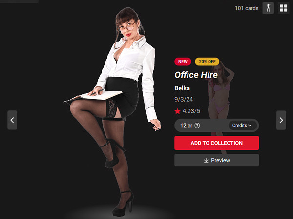
Personally I could not care less about the carousel, but I can say that modifying the detail card page has been a totally wrong choice in my opinion.
Everything was just perfect in that page on the old UI.
And, regrettably, everything on that page - which had the good fortune to be as beautiful as useful on the old version - has now been destroyed, on both aspects, in the new one.
It has been said it to be more confortable to have everything on same page without sub-pages - but actually, since everything is small, you have to continually scroll up and down. So that: not only you never get any overall view (which you instantly used to get on the old version) but also you have to waste WAY more time in order to find the info, the clip, the pic, the comment you are looking for.
Totem, please revert to the old Detail page, or add a Nostalgia switch to get it back for people who are not confortable with the new one.
denis963
Joined in Sep 2014 6 投稿
September 6, 2024
ок
Kusho
Joined in Jul 2016 7 投稿
September 6, 2024
It is hard to understand why did you dumped old UI.
Totally agree.
+1
mg777
Joined in Aug 2022 1 投稿
September 7, 2024
I like it, runs slow on my machine, hopefully performance improves once it is out of beta. I am glad that favoriting cards is back.
willyweekly
Joined in Jul 2015 431 投稿
September 7, 2024
Thank you all for testing and giving your feedbacks ! All the cases you reported are being analyzed by our developers who keep their eyes on this thread all day long :)Please continue 🤗
hey developer,
who is that behind you?
Ha! made you look!
While I am not the biggest fan of change, the new interface seems pretty good. Tweak the look as requested here but the main concern for me: Keep the beautiful models coming!
DestinationSeekr
Joined in Jan 2015 25 投稿
September 7, 2024
Here's some feedback:
1) Carousel is welcomed. 4 girls in the background would be better than just 2, for me (3840x2160) and I suspect anyone with a Widescreen/Ultrawide would appreciate 6 or 8 even.
2) Missing Standing view a lot, which is better than Card view for picking out desired dress colour easily and shows more cards at a time than Carousel. Each view has its own purpose so dont abandon the standing view, pls.
3) Favourites is great but needs to be a filter or tab with filters than a standard playlist.
4) Wishlist needs to be addable on the card view directly like favourites and also displayed on the detailed view page.
Overall, I agree with majority of the guys here, current version UI still much better than 2.0 and I will stick to it atleast till previews tab is back.
Socialhazard
Joined in Nov 2020 1161 投稿
September 7, 2024 (edited)
Must disable auto preview download. Didn't bother testing beyond that since last one.
Sangijuelappt
Joined in Jul 2019 21 投稿
September 8, 2024
I just installed the Beta version and it is very great, I liked it is more compressed but with better interface and interaction
I liked 3 things
1.- The carousel option to see the models is great and dynamic by accessing the list of options with a right click
2.- I love the idea that they allow us to stand out and choose our favorite shows marking them with a heart, this for me is great because that way I can classify my most favorite and important shows
3.- I love that now we can create personalized "lists" in an easier and more practical way. Although before in previous versions we could create "lists" it was a bit tiring to organize myself but now it is easier,
It also allows you to import and export the lists that are modified
What is the only thing you need?
in my opinion I consider that when creating the lists it allows us to have the option to enjoy the shows added in the created list and that they can be seen directly in the "FULL SCREEN" (I use the full screen a lot) and it would be great if in the options they allow us to enjoy the lists created.
because for now I can only click to enjoy it on the DESKTOP and add them to the queue
I again enjoy the software update and hope that these improvements will be retained in future versions or modified to make the experience better
THANKS TEAM ISTIPPER💗 💗
I liked 3 things
1.- The carousel option to see the models is great and dynamic by accessing the list of options with a right click
2.- I love the idea that they allow us to stand out and choose our favorite shows marking them with a heart, this for me is great because that way I can classify my most favorite and important shows
3.- I love that now we can create personalized "lists" in an easier and more practical way. Although before in previous versions we could create "lists" it was a bit tiring to organize myself but now it is easier,
It also allows you to import and export the lists that are modified
What is the only thing you need?
in my opinion I consider that when creating the lists it allows us to have the option to enjoy the shows added in the created list and that they can be seen directly in the "FULL SCREEN" (I use the full screen a lot) and it would be great if in the options they allow us to enjoy the lists created.
because for now I can only click to enjoy it on the DESKTOP and add them to the queue
I again enjoy the software update and hope that these improvements will be retained in future versions or modified to make the experience better
THANKS TEAM ISTIPPER
September 9, 2024 (edited)
they can be seen directly in the "FULL SCREEN" (I use the full screen a lot) and it would be great if in the options they allow us to enjoy the lists created.
because for now I can only click to enjoy it on the DESKTOP and add them to the queue
Open the playlist
use CTRL-A to Select ALL of the cards in the play list.
Right click on any of the cards, then Add to Top of Que.
Start Full Screen.
the cards displayed on Full Screen Now come from the QUE, which al all from the Playlist.
But I agree, the Full Screen should be More Front and Center.
It should be Added to the Left Menu.
and on the Playlist screen, there should be an Added right click option to Start on Full Screen.
in the Que Control, you can Toggle the Loop and Shuffle options on and off.
( you Must use have the Shuffle option enabled, Before you Add them to the Que. )
Loop is pro-Active and toggles on and Off even After makeing the QUE
Shuffle is only Active, for when you Add the cards to the Que.
it has No Affect of the cards already on the QUE list.
September 9, 2024 (edited)
Having used the new beta a few days now, here's some feedback:
Bugs/problems:
1) Sometimes one or few of the card images don't show in collection view. Synchronizing doesn't help. Right now at least Amalia Davis - Smooth Bunny is missing card image. A couple of days ago there was another one of the recent cards with similar issue, but now that one shows ok. The card images are in the data folder, so it's some kind of display issue in iS software.
2)
I bought Silvia Wise's first card about half an hour ago, but it still doesn't show in my collection. Synchronizing doesn't help. The card is playable and is downloaded, and the vghd+demo files are in correct folder. I had to go to my account history and click the link to the card there on my purchase to access the show. I can't find it with search "silvia wise" or by sorting cards by release date.
3)
Playlist playing order issue, already mentioned above.
Wishes/requests:
The new detail page is very well designed IMHO, but I would like to have navigation buttons on that page. So that whatever the card order is in Collection view, once you enter on detail page on any card, you could easily move to next/previous card with these buttons. Now you have to always return to collection view and select another card.
(this navigation improvement would also help one to get the nice bigger card images (with "_large" in file names) in data folders. I have noticed that those get downloaded only when you enter the detail page of that card. Going through your collection for this purpose would also be easier)
riurg
Joined in May 2013 6 投稿
September 10, 2024
I'd like to have to Previews tab back (it could be added under Store or Collection tabs) so that I can see what "demos" from the free preview push I have currently available and for how much longer the flash sale for them lasts.THIS!Yes, I agree
September 10, 2024 (edited)
@JonC001 wrote in reference to the post from @Dfner,
Ther are 3 different card images
aXXXX.jpg - used by the newer versions of iStripper
aXXXXc.jpg - used by the older version of VGHD Deskbabes and iStripper
162 x 242 w x h
aXXXX_large.jpg - used by iStripper 2.0 in place of the Fulldh image on the left side of the details view.
324 x 428 w x h
This image is only downloaded if you visit the cards details view.
you can make custom images by adding the _custom.jpg to the end of the file names
aXXXX_custom.jpg -162 x 242
aXXXXc_custom.jpg - 162 x 242
aXXXX_large_custom.jpg - 324 x 428 - Not Implemented yet
These are png images with a transparent background
aXXXX_nude_custom.png - has no Specific Width or Height but there may be a Max W x H that the size must stay within.
aXXXX_full_custom.png these are - 900 pixels tall
aXXXX_fullhd_custom.png these are -1500 pixels tall
if the _custom image exists in the data folder, it is prioritized in place of the regular image.
I don't believe that the Stickers / Overlay images are placed on the _custom card images.
So no logo / branding added on top of the image.
I have never seen a "_large" picture.
...
Is this something new, only seen in the istripper 2 betas?
Ther are 3 different card images
aXXXX.jpg - used by the newer versions of iStripper
aXXXXc.jpg - used by the older version of VGHD Deskbabes and iStripper
162 x 242 w x h
aXXXX_large.jpg - used by iStripper 2.0 in place of the Fulldh image on the left side of the details view.
324 x 428 w x h
This image is only downloaded if you visit the cards details view.
you can make custom images by adding the _custom.jpg to the end of the file names
aXXXX_custom.jpg -162 x 242
aXXXXc_custom.jpg - 162 x 242
aXXXX_large_custom.jpg - 324 x 428 - Not Implemented yet
These are png images with a transparent background
aXXXX_nude_custom.png - has no Specific Width or Height but there may be a Max W x H that the size must stay within.
aXXXX_full_custom.png these are - 900 pixels tall
aXXXX_fullhd_custom.png these are -1500 pixels tall
if the _custom image exists in the data folder, it is prioritized in place of the regular image.
I don't believe that the Stickers / Overlay images are placed on the _custom card images.
So no logo / branding added on top of the image.
まだ参加することはできません
iStripper の無料ユーザーはフォーラム内のトピックに参加したり新しいトピックを作ることはできません。
でもベーシックカテゴリーには参加できコミュニティーと接することはできます!