Age Verification
This website contains age-restricted material including nudity and explicit content. By entering, you confirm being at least 18 years old or the age of majority in the jurisdiction you are accessing the website from.
Our parental controls page explains how you can easily block access to this site.
0
Refreshing 掲示板 / iStripperに関する全て
SpaveInvader
Joined in Oct 2010 919 投稿
March 25, 2013
the layout seems ok - no very big changes. but why must it have a white background? for me it looks to bright.
@91hebasu,
probably Rex has not that much time to read all his messages :-)
@91hebasu,
probably Rex has not that much time to read all his messages :-)
The3LeggedMan
Joined in Feb 2010 369 投稿
March 25, 2013
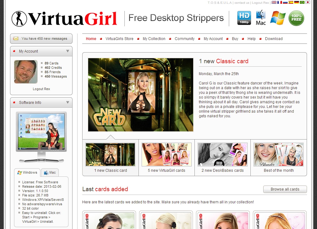
They got rid of the 3 ladies at the top of the page, Jewel, Lucky and Ariel. I will miss them.
member84392371
Joined in Oct 2009 1323 投稿
March 25, 2013
Indeed a small change, only thing that appears to have changed is the 3 chicks are gone. It looks less like a pornsite like that, perhaps that's good for the product.
TallandSlimMan
Joined in Apr 2008 466 投稿
March 25, 2013
hmm...how hard would it be to allow users to select a color scheme?? Like spaveinvader, I think the white is too bright.
jununger
Joined in Oct 2007 1243 投稿
March 26, 2013 (edited)

@91hebasu - About the messages... My thought exactly! The boss is busy =)
Clean but a bit to scaled down and cold for my taste. I like the softer color tones of the current page better. It makes me feel more at home. The cold white and gray theme looks less inviting to me.
450 messages is a lot! =)
PS. And I miss the ladies at the top... DS.
Clean but a bit to scaled down and cold for my taste. I like the softer color tones of the current page better. It makes me feel more at home. The cold white and gray theme looks less inviting to me.
450 messages is a lot! =)
PS. And I miss the ladies at the top... DS.
shodan084
Joined in Dec 2007 1652 投稿
March 26, 2013 (edited)
It's easier to read than that dark purple...
Oquijan
Joined in May 2009 1536 投稿
March 26, 2013
As others, I don't like the white. Too sanitary, too institutional for my taste. Maybe used to the current tone after many years, but I think is kinda a classic tone for the VG website and a huge part of its identity. The simple white makes it look like plenty blogs out there.
LOVERBOY1
Joined in Dec 2009 118 投稿
March 29, 2013
To determine whether the proposed refreshment is a good one, I would need to know your objective or your goal for the change.
As for my opinion of its looks, without regard for consequence: I happen to be one who likes white. It's clean, it's bright, it presents contrast, making for an easily read or viewed page. I think the color that's missing is the photo of the colorful and beautiful girls to be seen at the top of the current page. I think it may (definitely) be time for a different set of women to be up there, but I think the women who are the point of everything on this site should be at the top.
Here's a thought: how about featuring a frequently changed group (three or so) portrait of women(names artistically included)at the top? It would show what VirtuaGirl is all about and also show that many different women are included, important especially if many wonder if few women are involved when the picture is static and unchanging. Perhaps such a thing is not practical enough or affordable enough to be desirable, but otherwise I think my idea could be a good one. ;-)
DIDGEDRUM
Joined in Mar 2008 2336 投稿
April 5, 2013
Thanks Rex, looks like we two more languages to learn as well !...:)
jununger
Joined in Oct 2007 1243 投稿
April 8, 2013
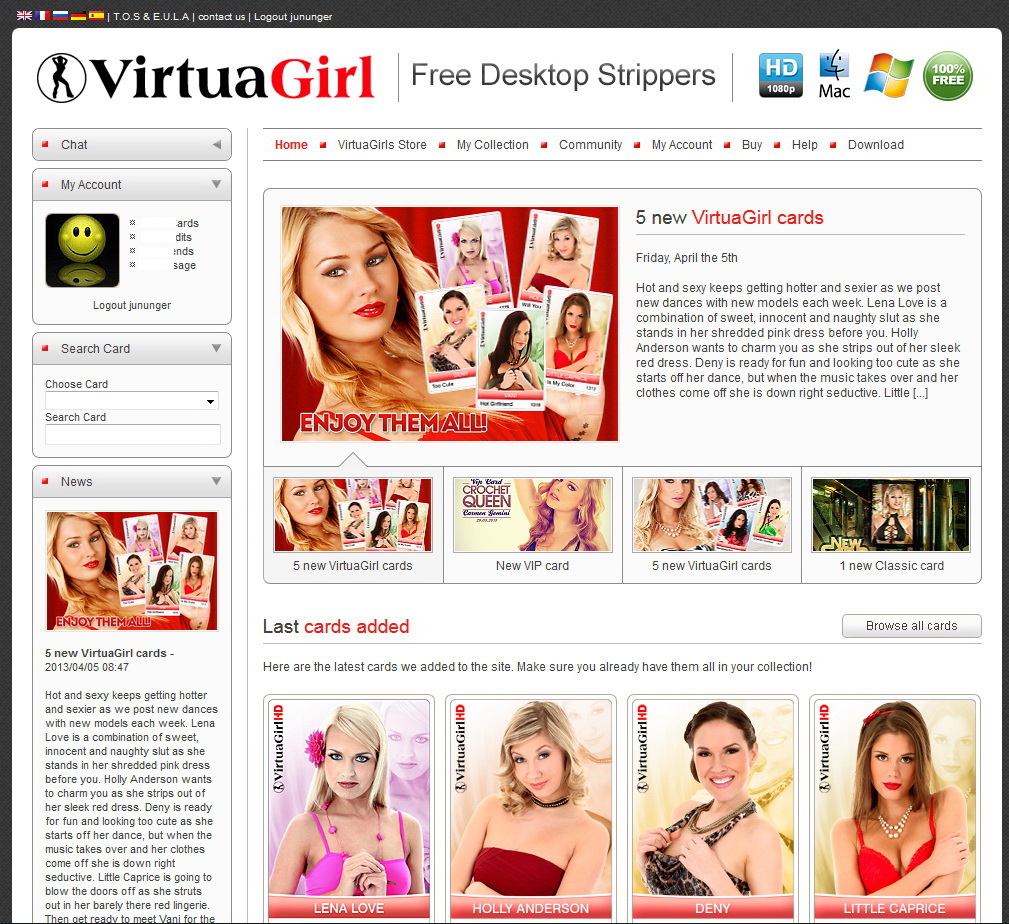
It's Here! =)
Still think it's to cold...
Still think it's to cold...
DMon1981
Joined in Jan 2010 385 投稿
April 8, 2013
I rather like this new look. At the moment just on my phone and not my laptop.
DIDGEDRUM
Joined in Mar 2008 2336 投稿
April 8, 2013 (edited)
Seven languages on Rex's version.....still 5 on ours !...Hmmm !...
Is that intentional on the " members " page ???...It looks like the Girls piccy has slipped...or is that Art ???...
Still not spelling " Sexes " correctly !...
Is that intentional on the " members " page ???...It looks like the Girls piccy has slipped...or is that Art ???...
Still not spelling " Sexes " correctly !...
Number1OldGuy
Joined in Jan 2011 61 投稿
April 8, 2013
I Like It.. It Looks Like A Hometown Newspaper.. Front Page News.. Showing Off All The Beautiful Girls In TOWN..VERY NICE..
まだ参加することはできません
iStripper の無料ユーザーはフォーラム内のトピックに参加したり新しいトピックを作ることはできません。
でもベーシックカテゴリーには参加できコミュニティーと接することはできます!