Age Verification
This website contains age-restricted material including nudity and explicit content. By entering, you confirm being at least 18 years old or the age of majority in the jurisdiction you are accessing the website from.
Our parental controls page explains how you can easily block access to this site.
0
New Card Font is hard to read Forum / Tout sur iStripper
PascalsWager
Inscrit en Jan 2009 81 message(s)
3 January 2020
The new card font is less legible than the old font. Why change perfection?
SetFuego
Inscrit en Mar 2008 730 message(s)
3 January 2020 (edited)
The new card font is less legible than the old font. Why change perfection?Full approval. I don't understand that either, I've already ***** about it in another thread.
http://www.istripper.com/de/forum/thread/41925/12?post=645594
Vous n'êtes pas autorisés à voir ce sujet et à accéder aux données relatives à ce sujet
HansSachs
Inscrit en Mar 2016 1007 message(s)
3 January 2020
The "old" style of writing is far better than the AllCaps styleI agree with this.
jt123
Inscrit en Apr 2008 183 message(s)
3 January 2020
Uh, well, ya nose, as a ***** I wuz tole dat do'n too much of a sertin "activitiy" wud make ya go blind -- jus say'n boys 'n girlz...
jt123
Inscrit en Apr 2008 183 message(s)
3 January 2020
I just KNEW you wuz gonna say sumthin jike dat Ms. Gkar!
I'z here ta tell's ya I got 20-20 vizion -- in 2020!
The title a dis here discuzion is ezy ta read --
"Nude Cow Front is Home to Feed"!
SO there!
I'z here ta tell's ya I got 20-20 vizion -- in 2020!
The title a dis here discuzion is ezy ta read --
"Nude Cow Front is Home to Feed"!
SO there!
Chicsans
Inscrit en Jul 2009 770 message(s)
3 January 2020
So your saying you can't read this........heheheheh
Reading is over rated anyway. We is to look at nekkid ladies. Not to read.
jt123
Inscrit en Apr 2008 183 message(s)
3 January 2020
Contracts?
I don got no contracts, I buy the shows one at a time!
Don need no glasses nethur!
An I kin read, spell and right PERFECT fine too, thank yu!
Even with just one hand!
I mean, if I NEEDED to I kud, if my left arm wuz broke'n... or somethin like dat.
I gotta go now. I'll be late fur my job at da Air Traffic Control Center.
jt123
Inscrit en Apr 2008 183 message(s)
3 January 2020
Reading is over rated anyway. We is to look at nekkid ladies. Not to read.
YA! Whut she sed too!!
3 January 2020 (edited)
@dgedge
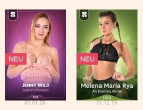
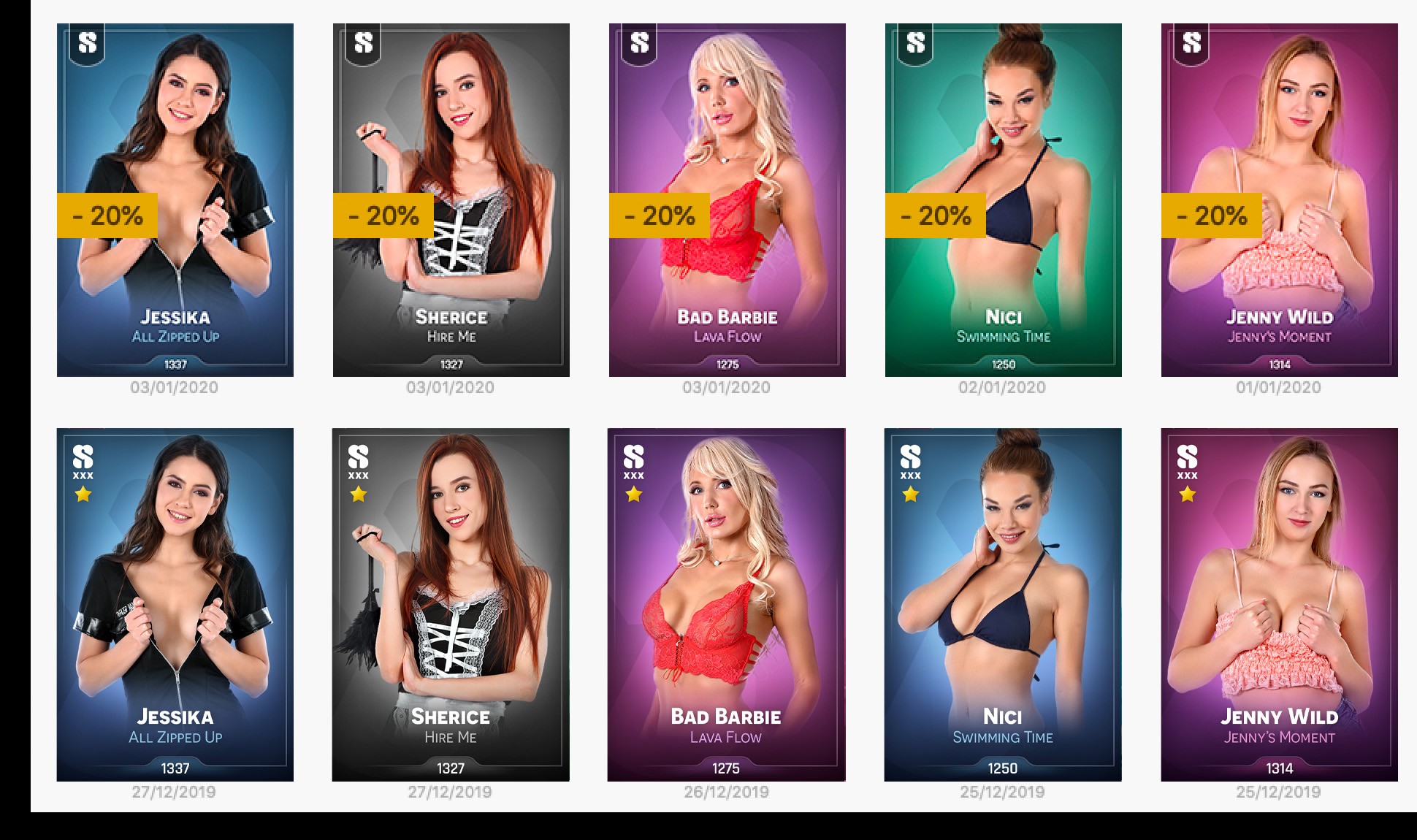
It seems to me that the only change is in the number of the card, which indeed is in bigger font. Other than that, the name of the card is more legible in bottom row only because the images in top row are compressed to the max... :) Clearly visible in the outline of the text and details in the pictures themselves. The font of the card title doesn't appear to be any bigger.
And of course it is strange to see XXX-symbol for e-series cards as well as that star indicating Special Event Card, but I guess that is just due to the template background.
HansSachs
Inscrit en Mar 2016 1007 message(s)
3 January 2020 (edited)
the only change is in the number of the cardNot true, also names of models and shows are in (very) slightly bigger fonts.
3 January 2020
@HansSachs
Yes, you are correct... apologies to @dgedge. I only watched how the width of card title compared to width of model name, and didn't notice any change. But yes, they are bigger.
But still, for some reason the card images on top row are much more compressed than the bottom row, which naturally makes the bottom row more legible.
AcidWizard
Inscrit en Jun 2014 24 message(s)
3 January 2020
Instant changes. Wow. That blows my mind.
SetFuego
Inscrit en Mar 2008 730 message(s)
4 January 2020
...and still hard to read all caps letters for the card title.
@stefnev1 would say: "Please, turn off Caps-lock, you don't have to shout on the card !"
@stefnev1 would say: "Please, turn off Caps-lock, you don't have to shout on the card !"
HansSachs
Inscrit en Mar 2016 1007 message(s)
4 January 2020
Best thing would just be to get lowercase back. It's far more beautiful and classy than capital letters everywhere.
4 January 2020
I'm not seeing the same issues, and I rather like the new All Caps letters, reminds me of a PLAYBILL
Where the 1st letter is 2 to 3 font sizes larger then the rest of the letters.
If anything, the entire Font Size could be increased by 2 or 3
but the All Caps is a non-Issue from my Perspective.
Where the 1st letter is 2 to 3 font sizes larger then the rest of the letters.
If anything, the entire Font Size could be increased by 2 or 3
but the All Caps is a non-Issue from my Perspective.
Nebal
Inscrit en Feb 2015 227 message(s)
4 January 2020
You can make the cards appear larger in the GUI. Not a big deal
lps999
Inscrit en Nov 2016 7 message(s)
6 January 2020
Adding my voice to the chorus -- that new font is way too small, and not an attractive all-caps. I have to squint to see the model name, and I really can't read the card title easily even when I've made the cards as large as possible in the GUI.
8 January 2020
I like that the fonts are slightly larger now.
But I don't like the all caps writing.
And maybe you could increase the contrast of the show names. The same color like the background looks cool, but around the text it could be a bit darker like in the edges of the card. I think that color style might also look good on the model's name.
But I don't like the all caps writing.
And maybe you could increase the contrast of the show names. The same color like the background looks cool, but around the text it could be a bit darker like in the edges of the card. I think that color style might also look good on the model's name.
Vous n'êtes pas encore autorisé à participer
En tant qu'utilisateur gratuit de iStripper, vous n'êtes pas autorisé à répondre sur le forum ou à créer de nouveau sujet.
Vous pouvez cependant consulter les catégories de bases et commencer à découvrir notre communauté !