Age Verification
This website contains age-restricted material including nudity and explicit content. By entering, you confirm being at least 18 years old or the age of majority in the jurisdiction you are accessing the website from.
Our parental controls page explains how you can easily block access to this site.
0
So like... Forum / Everything about iStripper
Wuzthis
Joined in Oct 2012 93 post(s)
October 21, 2016 (edited)
Is there any particular reason why you guys flit back and forth between censorship and no censorship in the downloader client?
It really just seems ***** in a very unnecessary way. Also jarring.
And while I'm here, can we at least get an option to hide buttons like "Music", "Full Screen", etc, from the client's main window? In some future update. The minimalist's design with the first iStripper iteration seemed to work just fine and the clean look went well with the revamp of the classic Deskbabes/Virtuagirl client. It wasn't hard to toggle music, full screen or access the options button either.
Why the deal over changing what ain't broken?
I just realised we have 2 'Full Screen' buttons. Is that a feature people rarely use?
Another edit: Ok, so I was quite wrong here. Going as far back as .106 with a link provided by another user, I see that the earlier iterations still featured the full screen and music buttons at the top, but there weren't 2 full screen buttons or a big purchase credit one either.
Still, I don't think it'd ***** to be able to toggle their visibility, no?
October 21, 2016
There are 2 Fullscreen buttons for a reason. One shows you the scenes you have installed and can check or uncheck them. The other just launches Fullscreen mode with whatever you have checked. Simple, really :)
Personally, I like the latest design/layout of the GUI. Why does the layout really bother you? Are you constantly looking at the top right of your screen or at the GIRLS! ;)
And yes, many of us use Fullscreen mode all the time. We love it :D
Personally, I like the latest design/layout of the GUI. Why does the layout really bother you? Are you constantly looking at the top right of your screen or at the GIRLS! ;)
And yes, many of us use Fullscreen mode all the time. We love it :D
Wuzthis
Joined in Oct 2012 93 post(s)
October 21, 2016
Maybe I'm looking at both xD
October 21, 2016 (edited)
Fair enough :)
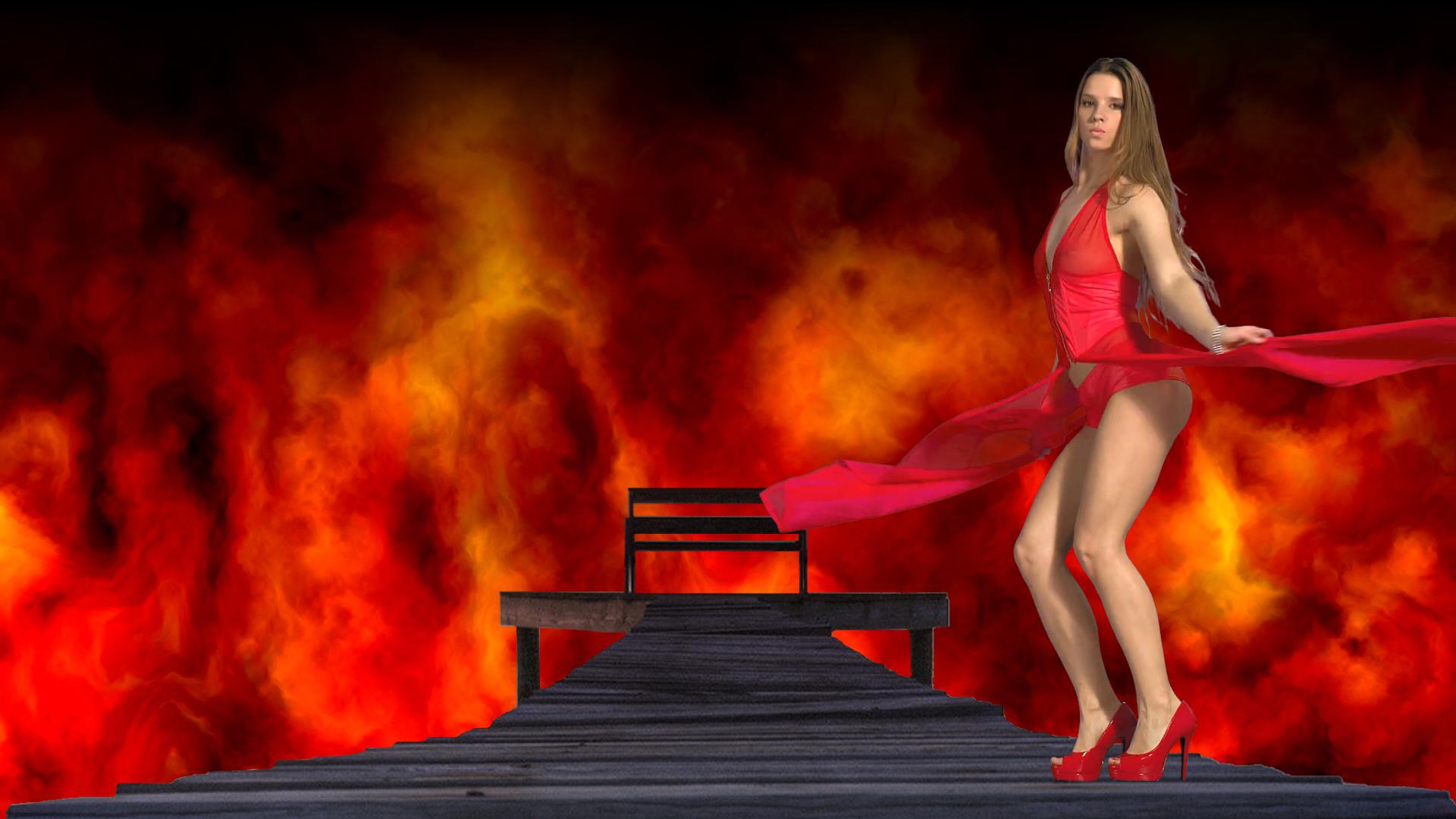
Have you checked out any of the member created scenes yet? There are literally hundreds and hundreds and the majority are absolutely awesome. For most of us scene creators and fans, this is the only way to go using the software and I thank Totem so much for giving us this amazing and fun tool to play with. (No pun intended).
Edit: A still from one of my own scenes...
You are not allowed to participate yet
As a free user of iStripper, you are not allowed to answer a topic in the forum or to create a new topic.
But you can still access basics categories and get in touch with our community !