0
Share your FullScreen - Member Created Scenes here Forum / Everything about iStripper
littleEvilMe
Joined in Oct 2015 42 post(s)
November 23, 2018
Thanks Everthangforever,
It means a lot, coming from yourself, as an established creator of many excellent scenes.
Apologies, first time up loader, rookie mistake!! I will definitely make sure i zip up my folders in the future.
Glad you liked the scenes, any particular favourite?
It means a lot, coming from yourself, as an established creator of many excellent scenes.
Apologies, first time up loader, rookie mistake!! I will definitely make sure i zip up my folders in the future.
Glad you liked the scenes, any particular favourite?
EverthangForever
Joined in Oct 2009 2540 post(s)
November 23, 2018
@littleEvilMe
If iStripper was bundling them with the installation, Yes there could be License issues.
But a member created scene, there should be no issue.
It's not being distributed as part of the Installation, or even an Automatic download.
At the very Most if there was, you would be simply asked to stop share them..
In Fact, Totem had Asked Members to recommend their Favorite Clubs to the Team.
The Team would then try to contact the Club for Photos inside, and Provide them FREE advertising
By Creating a Scene for their Club.
i am not sure if i would be allowed to share the rest of my collection as surely there must be some sort of agreement in place between totem and the clubs for them to be featured on istripper.
If iStripper was bundling them with the installation, Yes there could be License issues.
But a member created scene, there should be no issue.
It's not being distributed as part of the Installation, or even an Automatic download.
At the very Most if there was, you would be simply asked to stop share them..
In Fact, Totem had Asked Members to recommend their Favorite Clubs to the Team.
The Team would then try to contact the Club for Photos inside, and Provide them FREE advertising
By Creating a Scene for their Club.
ARoomWithAView
Joined in Sep 2012 24 post(s)
November 23, 2018 (edited)
these are great @LittleEvilMe
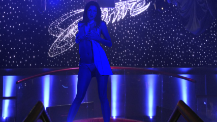
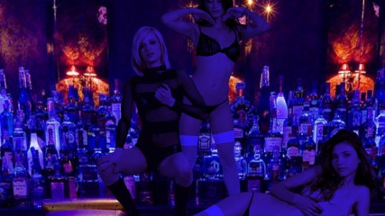
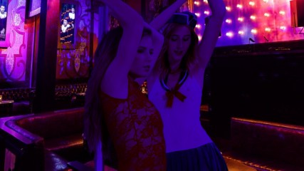
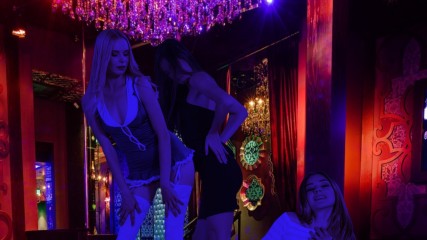
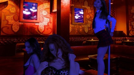
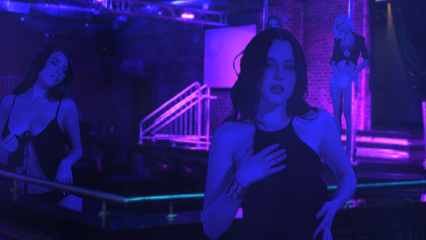
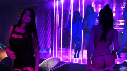
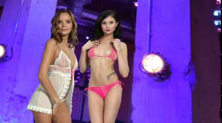
I have been fond of the bare elegance club scene for a while and always wished there was more done with it. The pans over the girls are very well done. The gel lighting along with the pans gives a real sense of depth and being there. I like scenes with multiple girls and your approach is a very nice variation I have not seen used before. I'll defenately keep these scenes.
I never kept the whisper club scenes because they are just a very slight variation on the penthouse club scenes of which I have a couple dozen variations already. But with your pans and the intiror feeling with mutiple girls I have a reason to go back to the whisper club now.
littleEvilMe
Joined in Oct 2015 42 post(s)
November 23, 2018 (edited)
@wyldanimal
"In Fact, Totem had Asked Members to recommend their Favorite Clubs to the Team.
The Team would then try to contact the Club for Photos inside, and Provide them FREE advertising
By Creating a Scene for their Club."
thanks for answering that, now you mention it i do recall totem saying something along those lines years ago.
"At the very Most if there was, you would be simply asked to stop share them"
This is excellent news i would be more than happy to stop sharing if there ever was an issue, so looks like we might be good to go for some more uploading!!
@roomwithaview
So glad that you enjoyed the scenes. I am really happy with how they turned out, and i am really happy that people seem to be liking them !!
All being well, I have plenty more scenes i can upload in the coming days, stay tuned folks !!
ARoomWithAView
Joined in Sep 2012 24 post(s)
November 24, 2018 (edited)
@LittleEvilMe
I am looking forward to seeing more of your scenes. The pans and layout of the moves are ingenious.
I have a background image that works perfectly when substituted for the Penthouse/Whisper club scenes because the location has the floor and ceiling visble.I cropped and did some matching so that i'd have more scenes with your great layouts. I kept the tables from the whisper club but took out everything else. And made a new logo for the new fictional club (I believe the image that i found years ago is of some sort of a storefront. I have not been able to discover where)
I think it works very well so here's a link to my juxtaposition of your whsiper club scenes: https://www.dropbox.com/sh/e0p5djsvsav0sjv/AACZ0bHCfuAplTfQvG7nhUOaa?dl=0
littleEvilMe
Joined in Oct 2015 42 post(s)
November 24, 2018 (edited)
@Roomwithaview
Good work!!! your scene looks great, i love the logo!! Glad i could inspire you to make some creations of your own.
So as my collection is rather large about 2.5 GB worth i thought i would be best if I split it up into smaller sections and release it in smaller chuncks.
Starting with Vegas Baby!! Be warned some of these scenes are EPIC !
Enjoy !!
https://www.dropbox.com/sh/38qxrt4ufo8noeq/AADblwWj0gROqwXT8b6h5N9Ta?dl=0
ARoomWithAView
Joined in Sep 2012 24 post(s)
November 24, 2018 (edited)
@LittleEvilMe I am checking out your vegas shows. Noticed some of them have graphic quality that aren't up to snuff. STill an amazing way to block a scene. When I've gone through these I'll upload some raw material to you. Night clubs and things of that nature. I have never figured out how to make a scene so I just edit the images and modify scenes. But I have a lot of good places for a scene, with different rooms and so forth. The AV nightclub in LA has some great images up of their club.
Back in a bit when i get things squared away. Your scenes really make you feel like you are in the place, because of the close ups, up front. By comparioson the other scenes I have looked at are staged like you're looking into a shoebox.
Back in a bit when i get things squared away. Your scenes really make you feel like you are in the place, because of the close ups, up front. By comparioson the other scenes I have looked at are staged like you're looking into a shoebox.
littleEvilMe
Joined in Oct 2015 42 post(s)
November 24, 2018
@roomwithaview
Alas indeed, some of the background images are a bit iffy, not to mention some dodgy photoshoping in places lol, however i figured would upload then maybe request to see if totem could obtain better images for the ones that need replacing by general consensus.
No problem if you want to up load some images, i think there is an artwork forum that you could do that on, would be happy to take a look and see what i can do with them.
Also i am happy to chat about any changes you think i could do to make the scenes better (apart from the background images) over on the discussions thread (open invitation to anyone really), Not sure if you have got to it yet, but the lap dance scene is a but highly experimental this stage and a little bit hit or miss in that it either works really well with the clip or it doesn't not much middle ground, its definitely not an exact science and you do need to use your imagingation as to where you think your lap is , you know being the invisable man and all.
Are you from LA?
ARoomWithAView
Joined in Sep 2012 24 post(s)
November 24, 2018
@LittleEvilMe
I am from california but its a coincidence about the AV club Being in LA. I really liked the atmosphere in the Pictures. I made a transparent logo for my modified scene of the club where the V in AV is a martini glass whith an olive being dropped into it.
I like the rain image in my default so a modified a scenes and made a ocation called the rain club. The transparent logo has a little umbrella. I made a couch scene with an absinth theme.
I have been looking at your scenes and some of them are really clever. Like the scene with the cut out of the mirror where you watch her strip on the couch and then pan and watch her strip in the mirror.
I think the issue with the backgrounds is just you have to zoom in in the extreme. I think that is why when you put color on the girls and make some of them further back hazy, it melts away the skepticism a bit and you feel like you're there.
As far as criticisms, I think your logos are bad. lol. and you put the model name too big. I had to turn off the model names because i got pulled out of the scene by them.
I can really see what you're doing and i also see what you were able to do with the whisper club and the bare elegance sceene as what you're capable of with a high quality image to work from. Some of these are better than others. I am looking at it on a 4k monitor with 3k strippers and its 55 inches.
Your choice of where to put the models a lot of times times out perfectly. It looks like they are dancing together sometimes. The lap dance scene is good. The face once was a little distorted. But the task scene where they wiggle their ass just above the task bar is perfect for a lap dance effect. I think it works,
Here is my clip art from some of the stuff I have put together. The AV club interiors are all in here.
https://www.dropbox.com/sh/qehedkkp910c1bo/AADfkrssfj53fv--JD1tuETVa?dl=0
littleEvilMe
Joined in Oct 2015 42 post(s)
November 25, 2018 (edited)
@roomwithaview
Thanks for the feedback and thanks very much for the images the AV club looks great there is bags of potential there.
Your dead right about the zoom, its hard to find pictures that can stand up to it !
But you picked a good one here !!! Just finsihed a scene based on one of them. So its hot of the press, The logo with the martini glass sounds cool, you should add it on for sure!!
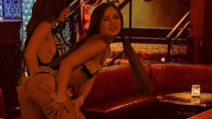
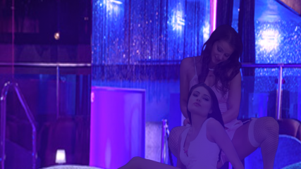
So this is a Intimate Private Dance scene with two girls around the central sofas under the light of the shanderleer. It will play either 2 standing clips or 1 standing clip and 1 front table (no accessories) so not every fronttable will play mainly regular cards rather then xxx , with the front clip being the one you can change on demand, No name clips on this one. Let me know if you would like a third girl maybe up by the stairs on the landing?
So there you go, your very own custom made littleEvilME - original
let me know what you think!
https://www.dropbox.com/sh/8m1pla96s5hsebn/AABO_9vnAiRIDG9PCOVrklHea?dl=0
ARoomWithAView
Joined in Sep 2012 24 post(s)
November 25, 2018 (edited)
That's great! @LittleEvilMe
and it just so happens that I was reconstituting some of your scenes from th Palamino club and making them work in my av club/ i'll share what I have as the room layout for the club. Most of the scenes were taken from the penthouse club but not all of them. You have to keep them in seperate files because they pull a background image from a file name in the folder the scenes are in.
I made 2 of your palamino club scenes work with 2 different backgrounds. A party area background and the bar. You'll see, just download these and you'll see your palamino club coreography and lighting mixed into th AV club. There are about 24 scenes in all. Six of them (the best ones) are based on the theft and reconstitution of your scenes.
I really love the pans because there is so much hot detail in the individual teases but its not the same to magnify it or something. You stack the girls up and it's like a whole new dimension of the program.
And by the way my martini glass logo is in these scenes. But i couldn't get them to work for your palimono club stuff. I missed something in the file name someplace.
PS. have you seen the Exorcist. DO you know the floating demon face that pops up suddenly in a couple places? I got an image of that and made it transparent as the small logo on a scene so after ten minutes it would pop up for four or five seconds. I scared the ***** out of a couple of my buddies innocently enjoying a strip scene with that little trick!
the AV scenes https://www.dropbox.com/sh/97m17kd0e6ped2a/AACoTz4ZaW-_BvQu_YIcW0ZJa?dl=0
littleEvilMe
Joined in Oct 2015 42 post(s)
November 25, 2018
@gkar45
Glad you liked it, I love mary rock too she is class!!
@roomwithaview
Wow you have been busy !!
These are really good mate, just had a look at a few of them, I like the first one that you did of the bar, with just the single girl, there is some great detail in there the reflection of the floor looks really cool.
I got a tip for you, so when you do a scene like that one its always good to play around with the clip rotation (even if you end up putting it back to normal). So in the clipsprite bit if you add in the line rot: 0,0,0 (i normally just put it under the pos: line) then play around with the middle number. Most people will just set this to 180 so that the clip is completely reversed and writting with read normally and the clip will remain horizontal. But it is possible to stray a little bit from the 180 mark without breaking the clip and you still get the writiing the correct way round. You can usually get away with a value from about 160 to about 200 degrees. Wwhat this does is slant the clip so that what would normally be horizontal motion will now be slanted so it looks like the girl is walking towards/away from you, it does all the scaling automatically so the clip gets bigger or smaller as she gets closer or further away from the camera, and its a really good way of adding depth to the scene.
its a cool effect, you should try it out.
PS Strangely enough i have not ever seen the exorcist, but cheers for the warning i will look out for any random deamons in your future scenes.
ARoomWithAView
Joined in Sep 2012 24 post(s)
November 25, 2018
@LittleEvilMe to be honest i have never done anything with a scene but change and match new artwork to it, sometimes create a stage, sometimes use sources like the AV Club for location.
So technically i never get into the design stuff as far as where to go with the camera. I wish I could. Your scenes go full on cinemac. Like a camera man capturing the action, rather than a canned slow pan in.
I look at other people's scenes and tinker with them. Remove furniture. match it to a picture. I go in and see how it works. Remove a screen. There will be something I don't like it in. Pull that out.
The vast majorty of those AV Club scenes are from the dias scenes in the penthouse club. So if you look in at the artwork you'll probably find its source. Like I probably changed the name of the champaign table and tiger chair cut outs so they won't show up in the scene.
Also in the logo section it probably says "large_logo_penthouse" as the file name and i just delete the orogonal logo and substitute mine in with that file name.
I'll see a scene somebody made and a lot of the time i'll see potential in it and say "I can use that here!"
But i am more like a kid that takes apart a radio. I haven't built or designed a radio.
littleEvilMe
Joined in Oct 2015 42 post(s)
November 25, 2018
@roomwithaview
Thats cool man, thats exactly how i started out, In truth its a lot easier to change a scene that already exists rather then write from scratch.
For me i had this scene done by Titti called Titti pole scene something like that, it was an absolute classic, loved that scene, but everything that i have ever writen was based off that. So if you guys like what i have been doing with the whole cinematic view thing then he should defo get some credit for laying the ground work.
Thats part of the reason why i wanted to share my work on here so that it laid out a base for other people to work off.
Also the scene that you did with the close up of the bar and the girls dancing up on it, kinda reminds me of one of those coyote ugly bars lol
I think you have some good ideas mate, you should definiately continue "tinkering"
ARoomWithAView
Joined in Sep 2012 24 post(s)
November 25, 2018 (edited)
@Titti is a genius! Best scenes in the world. His rooms, his London Underground, with the window carriage and the nex car moving, his sci fi theme stuff. His fashion show. I kept about all of his shows. Its really intricate work!
But I have to say that what you do with your pans is different from the cassice stuff I have seen by him. Which is mostly pretty front on. And I never noticed him doing the the color change except I guess in one champaign room scene. The whole room is red and the model is red tinged.
Your shows have the girls changing tone so it seems like a light effect. He did do some really cool stuff with flashbulbs. Titti is ike Mozart when it comes to this stuff! But you're really good with groups of girls. That's what is original about your scenes. The girls aren't each in a seperate niche, but overlapping and well placed.
>>>>
What I like about your stuff @LittleEvilMe , is that there are certain touches you get right/ I have seen a lot of people get them very wrong. For instance changing the shape slightly to give a feeling the model is moving a different direction. When you do that, you do it with a camera moving and it works. Because of where the camera is. I have seen front on scenes where they did that and it just didn't work. The model looks wrong and oddly shaped like a flat piece of paper with a 3d image turned toward the side.
It might also help that I recetly switched to 3k so that might make some difference I can't say. And there is always variation with the way things work depending on your set up. But a lot of it is just having a good visual sense for when something works/
I think a lot of guys churn out scenes and like to experiment. Which is also cool. I think I have the visual acumen (or at least I have an opnion that i think is right, just like everybody does). I just don't have the know how and I'm intimidated about doing a scene from scratch.
Z22
Joined in Aug 2017 1166 post(s)
November 25, 2018
Guys, this thread is for posting new scenes, goto the discussion thread if you want to chat about them.
ARoomWithAView
Joined in Sep 2012 24 post(s)
November 25, 2018
It's the fuzz!
littleEvilMe
Joined in Oct 2015 42 post(s)
November 25, 2018
@Z22
Apologies
@roomwithaview
yep we will continue this over on the other thread later for sure
Apologies
@roomwithaview
yep we will continue this over on the other thread later for sure
DANO70
Joined in Feb 2008 742 post(s)
November 25, 2018
Nice scenes guys thanks for shareing.
littleEvilMe
Joined in Oct 2015 42 post(s)
November 27, 2018 (edited)
@DANO70
No problem mate,
>>>
Got a few more here as well..
I did another sceen for the AV nightclub so there should be 2 in here now still includes the original in the folder but this is the new updated link to both scenes.
https://www.dropbox.com/sh/8m1pla96s5hsebn/AABO_9vnAiRIDG9PCOVrklHea?dl=0
And this link is for some more Strip clubs in the US (non Vegas)
I included the flashdancers scenes even though the images are not all that, but i like the scenes and they are still worth a watch. The oher clubs are pretty good though so hope you enjoy. ( the picture is from the platinum room sceen at the factory in chicago).
edit by MOD - Correct Link
https://www.dropbox.com/sh/gsg7s290jzqc5zx/AAA0lw4G5o6Kdlkk4z0VmSbYa?dl=0
littleEvilMe
Joined in Oct 2015 42 post(s)
November 27, 2018
Doh !!!
Sorry about that, Try this one instead.
https://www.dropbox.com/sh/gsg7s290jzqc5zx/AAA0lw4G5o6Kdlkk4z0VmSbYa?dl=0
Sorry about that, Try this one instead.
https://www.dropbox.com/sh/gsg7s290jzqc5zx/AAA0lw4G5o6Kdlkk4z0VmSbYa?dl=0
ARoomWithAView
Joined in Sep 2012 24 post(s)
November 27, 2018
@littleEvilMe these are great! It's amazing how you've documented all these IRL clubs from all over. Thanks again for sharing.
littleEvilMe
Joined in Oct 2015 42 post(s)
November 27, 2018
Thats the power of Google for ya lol
littleEvilMe
Joined in Oct 2015 42 post(s)
December 5, 2018
Hi Everybody
Got some more Strip club scenes to upload, I really like all of these, but if you pushed me i would probably say FYEO-Southampton was the best but let me know what you think, over on the discussions thread.
For those that aren't not from the uk so might not know, FYEO (fot your eyes only) is a brand of chain strip clubs situated in various places in the uk. These are my recreations of them, hope you enjoy !!!
https://www.dropbox.com/sh/bpp32o0zea45nyu/AACagfgHVMZsNdD8c7zpUH2da?dl=0
December 8, 2018
I have made a lot of changes, and I still feel pretty good. Hahahaha. Please enjoy.
https://drive.google.com/open?id=1Rd4TadA-zpiM3Fsu4LspgDC7DQnZOAVn
clip {
id: Clip
deny: top,// table,
nameGlowColor: 1, 1, 1
}
You can also open this if you don't care.
https://drive.google.com/open?id=1Rd4TadA-zpiM3Fsu4LspgDC7DQnZOAVn
clip {
id: Clip
deny: top,// table,
nameGlowColor: 1, 1, 1
}
You can also open this if you don't care.
Z22
Joined in Aug 2017 1166 post(s)
December 11, 2018
https://drive.google.com/open?id=1uBg_anvs-fP7jOGN1v2rCvtLc3xkN1mQ
Just creates a nice colour cycling gradient background.
Just creates a nice colour cycling gradient background.
December 13, 2018
I originally posted these a long while back.
They are specifically for Glass clips.
I needed space in my dropbox account some time ago and the original file got deleted.
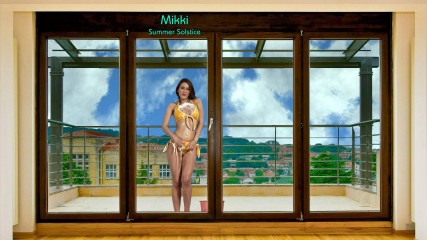
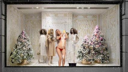
Someone has requested them so I have put them back up on dropbox. I have also added a couple of Xmas ones (thanks to @TheEmu for the snow shader used in one of them).
If anyone else wants them the link is below
https://www.dropbox.com/s/qxux2352ipe0b9g/No.6_Window%20Scenes.zip?dl=0
Just extract the folder in the zip file into the IStripper "scenes" folder.
Z22
Joined in Aug 2017 1166 post(s)
December 15, 2018 (edited)
3d setup for Vive/Occulus
https://drive.google.com/open?id=1doqEXm2HtgTJ6WTo2VFLg8l2Tt6qz8Au
This adds enhance and motion interpolation to my refract 3d scene.
This has been set for best viewing on the vive or occulus (haven't tested occulus so report back if you test it).
You will need to record the output with your gpu's own software( most screen capture software uses the cpu and it will tank the fps)
nvidia shadowplay Start recording by pressing alt + f9 then start the scene. Starting recording after scene has launched will exit the scene even if you remap a mouse button as alt&f9.
Amd re-live (no idea as i don't have an amd card anymore) but i guess you will need to start recording before starting the scene too.
Additional requirement is vr software that can play side by side video as 3d in the headset such as whirlgig...
https://store.steampowered.com/app/451650/Whirligig_VR_Media_Player/ it's only £3 if you don't already have it.
I have the distance set to 1.5 and scale to 2.0 with eye seperation set to -0.19 (by default you can see lines appear at the edge of the screen as whirligig gets the wrapping slightly wrong)
You can view this in crosseyed if you like but you need to reverse the refracts in combine(just swap the source names over)
You are not allowed to participate yet
As a free user of iStripper, you are not allowed to answer a topic in the forum or to create a new topic.
But you can still access basics categories and get in touch with our community !

